
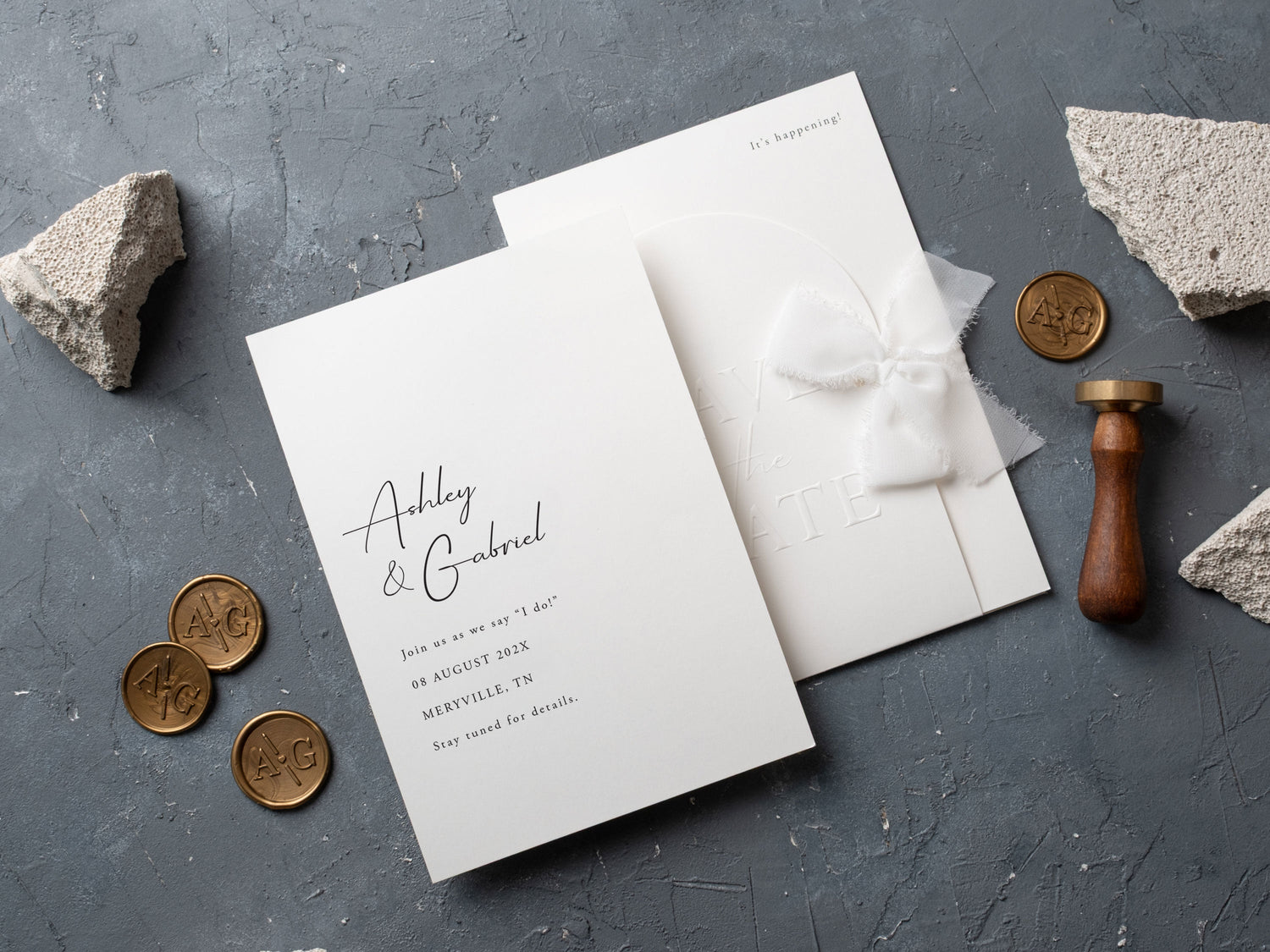
In short: The most stylish save the date designs combine one memorable feature with clear practical details. Embossing, sculpted shapes, restrained color, and a well-chosen photo can feel current without becoming dated. Choose a design that previews your wedding tone, keeps names and dates easy to scan, and complements your invitation suite.
A save the date is often the first physical glimpse guests receive of a wedding. It does not need to reveal every design choice, but it should establish a clear mood and make the essential details easy to understand. The most effective cards feel distinctive at first glance and remain practical when guests return to them later.
Current design ideas can still have lasting appeal when they are used with restraint. Embossing, a sculpted edge, a personal photo, or a strong type layout can each become the main feature. This guide explains how to choose one of those elements, keep the card readable, and connect it naturally with the invitation suite that follows.
What Makes a Save the Date Design Feel Stylish?
A stylish design has a clear visual hierarchy. The couple's names and wedding date should be easy to find, while the location and note about the formal invitation remain secondary but readable. When every element has the same size, weight, or decorative treatment, the card can feel crowded.
One strong idea is usually more memorable than several small trends. That idea might be raised lettering, a well-composed photograph, an arched top, or an unexpected but controlled color. Generous spacing lets the chosen feature stand out and keeps the practical information from competing with it.
Material and finish also influence the mood. A tactile surface can make a minimal layout feel special, while a simple card lets a photograph or shape lead. Browse save the date cards to compare how embossed, photo, shaped, and minimalist designs handle the same essential details.
Which Save the Date Trends Have Lasting Appeal?
Embossed lettering has lasting appeal because it adds texture without requiring a complicated layout. Clean type and a limited palette allow the raised detail to remain visible. It can feel classic on a rectangular card or more contemporary when paired with a curved or irregular edge.
Arches and gentle sculpted shapes can also age well. Their impact comes from the silhouette rather than a short-lived graphic effect. A restrained photo layout remains personal and recognizable, especially when the image has open space for names and the date.
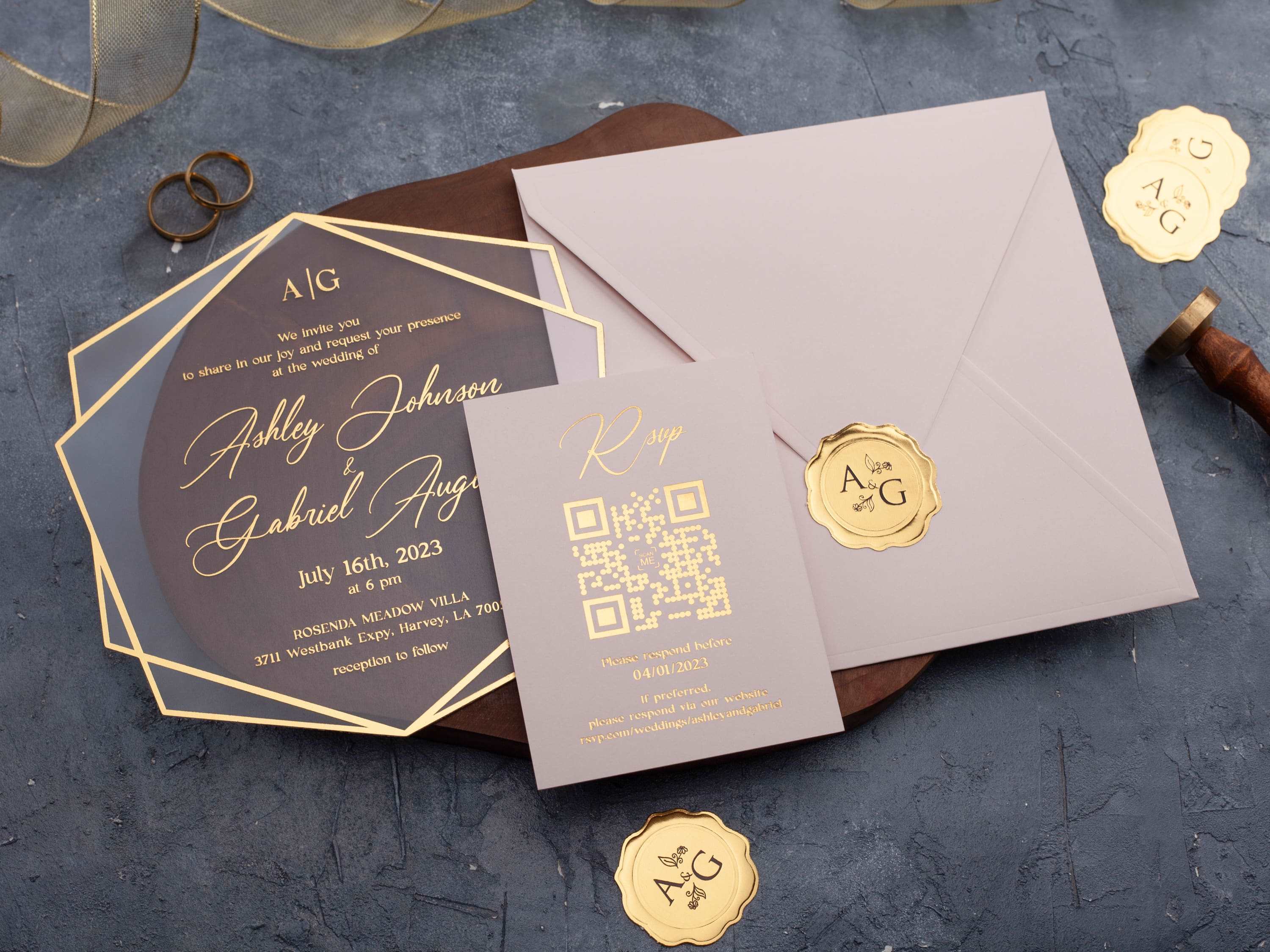
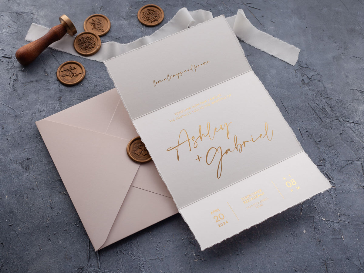
Neutral and muted colors are flexible, but timeless does not mean colorless. A rich green, blue, burgundy, or warm blush can remain elegant when it supports strong contrast. Foil can add a focused reflective accent; compare foil printed wedding invitations if you plan to carry a metallic detail into the later invitation suite.
Should You Choose an Embossed or Photo Design?
Choose embossing when you want the material and typography to create the focal point. It works well with short wording, open spacing, and a limited number of colors. Because the design does not depend on a specific image, it can establish the wedding mood in a subtle way.
Choose a photo design when the image adds personal meaning and can carry the visual weight of the card. Use one strong photograph with a clear subject and enough quiet space for the wording. A crowded background, several small images, and multiple type styles can reduce both impact and readability.
Think about how each option relates to the wedding invitations. An embossed save the date can introduce texture that later appears in the main suite. A photo card can stand on its own while sharing a color or type style with a more formal invitation. Explore photo wedding invitations if personal imagery will remain part of the complete stationery story.

How Can Shape and Spacing Make a Design Feel Modern?
Shape changes the silhouette before a guest reads a single word. An arch softens a structured layout, while a wavy edge adds movement. The strongest shaped cards keep the interior composition simple so the edge remains the memorable feature.
Spacing is equally important. Leave clear separation between names, date, location, and the note that an invitation will follow. Open space can make a small card feel intentional and gives decorative lettering room to breathe.
Keep the number of alignments and type styles under control. A centered layout can emphasize symmetry, while a carefully aligned asymmetrical layout can feel editorial. Either approach works when the eye moves through the information in a predictable order.

Which Colors Keep Save the Dates Elegant and Readable?
Choose contrast before choosing a trend. Dark text on ivory, white, blush, or another pale background is easy to scan. Light or metallic lettering on a deep background can also work when the type is large enough and has sufficient weight.
A limited palette gives the card a clearer identity. One main color, one neutral, and an optional accent are usually enough. If the photo already contains several colors, borrow one quiet tone from the image instead of adding an unrelated palette around it.
Review all numbers and place names at their final size. Small pale lettering may look elegant on screen but become less clear in print. A proof should show the final wording, color, and placement so you can judge the real hierarchy rather than the sample design alone.
Should Save the Dates Match the Wedding Invitations?
They do not need to match exactly. A save the date can introduce the same mood through one recurring element, such as a color, typeface, monogram, foil tone, or curved shape. The invitation can then develop that idea with more detail and a more formal information structure.
Coordination often looks more thoughtful than duplication. For example, a photo save the date can use a warm neutral that later appears on a text-led invitation. An embossed card can introduce a minimal type style that returns on a layered or foil design.
Keep the guest experience consistent even when the artwork changes. Names, dates, and locations should use the same spelling and presentation across the stationery. Compare the wider wedding invitations collection when deciding which visual detail should carry forward.
How Do You Choose a Design That Will Age Well?
Begin with the details guests need: the couple's names, wedding date, general location, and a note that a formal invitation will follow. Build the design around that information instead of forcing the wording into a layout chosen only for its decorative features.
Then select one dominant visual idea and edit away anything that competes with it. If the photograph leads, simplify the type. If embossing leads, leave room for the texture. If the edge is sculpted, use a calmer interior layout. Restraint makes each choice more visible.
Finally, imagine the card beside the future invitation rather than judging it in isolation. It should preview the celebration without limiting every later choice. Confirm personalization and production details on the product listing, then review a final proof for spacing, contrast, names, date, and location.
Frequently Asked Questions About Stylish Save the Date Designs
When should save the date cards be sent?
Many couples send them several months before the wedding, allowing more time for destination events or guests who need to travel.
Do save the dates need to match the invitations?
No. They can introduce the same mood through color, typography, or one recurring detail without duplicating the invitation design.
What information belongs on a save the date?
Include the couple's names, wedding date, general location, and a note that a formal invitation will follow.
Are photo save the dates still stylish?
Yes. A strong image, restrained typography, and uncluttered layout can make a photo design feel polished and lasting.
What makes an embossed save the date feel modern?
Clean lettering, generous spacing, a simple shape, and a limited palette let the raised detail remain the focal point.
How many design trends should one save the date use?
Usually one dominant feature is enough. Combining too many shapes, finishes, colors, and type styles can weaken clarity.
Explore our save the date cards to compare embossed, photo, minimalist, and sculpted designs for your celebration.

Leave a comment
This site is protected by hCaptcha and the hCaptcha Privacy Policy and Terms of Service apply.