
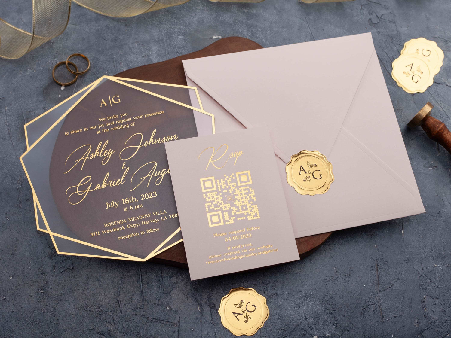
In short: Blush and gold foil wedding invitations combine a soft romantic base with a warm reflective accent. Keep the palette elegant by limiting supporting colors, using readable typography, and choosing either acrylic or paper to match your venue. Repeat blush or gold selectively across the suite for a coordinated result.
Blush and gold create an invitation palette that feels warm without becoming visually heavy. Blush softens the overall design, while gold foil gives names, borders, or small decorative details a more defined finish. The result can suit a romantic garden ceremony, an elegant ballroom, or a clean modern celebration.
The strongest designs do not rely on color alone. Material, wording contrast, spacing, and the way each piece coordinates all affect the final impression. This guide explains how to balance blush and gold foil so that the invitation feels personal, polished, and easy for every guest to read.
Why Do Blush and Gold Work So Well Together?
Blush is a quiet warm color, and gold adds light and definition. Because both sit on the warmer side of the palette, they feel naturally connected. The contrast between a matte blush surface and reflective foil also creates interest without requiring several competing colors.
The pairing is flexible because either color can take the lead. A blush card with a small gold name feels soft and romantic. A clear or neutral invitation with gold wording and a blush jacket gives the palette a cleaner, more structured direction. Browse gold foil printed wedding invitations to compare how the finish changes across colors and formats.
Scale matters as much as color. Gold is most effective when it identifies a focal point, such as the couple's names, a monogram, or a fine border. If every line and ornament reflects equally, the important information can lose its hierarchy.
Which Supporting Colors Complement Blush and Gold Foil?
Ivory and warm white are reliable supporting neutrals. They keep the palette light, give gold enough contrast, and prevent blush from becoming too sweet. Taupe and beige create a more tonal result, while soft sage introduces a natural accent for garden or outdoor settings.
Deeper colors can make blush feel more formal. Burgundy, navy, forest green, and charcoal provide visual weight and make pale details stand out. Terracotta creates a warmer, earthier palette that can work well when the venue or floral plan already includes clay and rust tones.
Choose one neutral and, at most, one stronger accent. The invitation will already have contrast from the foil, so extra colors should support the design rather than compete with it. If floral artwork introduces several shades, repeat only one or two across the rest of the suite.
Should You Choose Acrylic or Paper for This Palette?
Acrylic gives blush and gold a crisp, dimensional quality. A clear card can let a blush envelope or jacket show through, while frosted or colored acrylic creates a stronger background for reflective lettering. This combination often feels modern because the material itself supplies much of the visual interest.
Paper creates a softer and more tactile impression. It can support flat color, fine artwork, folded formats, or travel-inspired layouts while keeping the palette warm and approachable. Paper is also useful when the wording is long because a solid background can make smaller text easier to organize.
Neither material is automatically more formal. A minimal acrylic design can feel understated, and a layered paper suite can feel highly formal. Compare the venue, amount of wording, preferred presentation, and the way the finished piece will look in real lighting. Explore acrylic wedding invitations if transparency, layering, or a sharper finish is central to your style.

How Can You Keep Gold Foil Wording Easy to Read?
Begin with a clear contrast between the lettering and its background. Gold foil is reflective, so its appearance changes with the angle and light. Essential details should not depend on a very thin script or a busy area of artwork to remain visible.
Use decorative lettering selectively. The couple's names can carry more personality, while the date, time, location, and response information should use a simpler typeface at a comfortable size. Short lines, consistent alignment, and generous spacing make the design easier to scan.
Review a realistic proof rather than judging color from a screen alone. Check the names, numbers, and venue details first. If acrylic, a jacket, or another layer sits behind the text, consider the complete assembled view because that background can change the apparent contrast.
Which Wedding Styles Suit Blush and Gold Invitations?
Romantic and garden weddings are natural matches. Blush can echo soft florals, while restrained gold details add polish. An ivory base and botanical artwork can keep the palette airy for a daytime ceremony.
For a modern wedding, use clean typography, open spacing, and a simple card shape. Let gold mark one focal point and allow blush to appear as a jacket, envelope, or controlled block of color. A transparent acrylic layer can make the familiar palette feel more architectural.
Formal evening celebrations can add navy, burgundy, charcoal, or a structured folded presentation. Destination weddings can use blush and gold on a passport-inspired design without losing clarity. The format and typography establish the level of formality; the palette adapts to them.
How Should the Rest of the Invitation Suite Coordinate?
Coordination does not mean making every piece identical. Repeat one recognizable detail, such as the blush tone, gold names, a monogram, or a fine border. Then use neutral space to separate the main invitation from supporting information.
If the invitation is visually detailed, keep the remaining pieces simpler. A blush jacket can frame a clear acrylic card, while an ivory information card keeps practical text readable. If the invitation is minimal, a shaped layer or a deeper accent color can add contrast without changing the core palette.
Compare all pieces together before approving them. Small differences in blush tones can be attractive when they appear intentional, but competing pinks and metallics may make the suite feel disconnected. The wider foil printed wedding invitations collection can help you compare foil placement, color balance, and presentation.

How Do You Choose the Right Blush and Gold Design?
Start with the information the card must hold. Longer wording needs a calm background and a straightforward text structure. Shorter wording leaves more room for foil, artwork, a monogram, or an unusual shape. Make sure the design works with your real names and venue details rather than only the sample wording.
Next, decide whether blush will be the main surface or a supporting layer. Then choose yellow gold for a clearer classic contrast or rose gold for a softer tonal effect. View the combination beside your other wedding colors and in lighting similar to the venue whenever possible.
Finally, confirm the available personalization, material, and included pieces on the product listing. A design should look cohesive after every detail is customized. You can also browse the full wedding invitations collection to compare blush and gold with other palettes before choosing your suite.
Frequently Asked Questions About Blush and Gold Foil Wedding Invitations
Is blush too pale for wedding invitation wording?
Blush works best as a background or accent. Use dark charcoal, black, or a sufficiently strong metallic finish for essential wording.
Does gold foil look good on blush acrylic?
Yes. Gold foil adds warmth and definition, but the design should preserve enough contrast around names, dates, and venue details.
What colors pair with blush and gold invitations?
Ivory, white, sage, taupe, terracotta, burgundy, and navy can all work, depending on the season and level of formality.
Can blush and gold invitations suit a modern wedding?
Yes. Clean typography, generous spacing, and a simple shape keep the palette modern rather than overly traditional.
Should envelopes match the blush invitation exactly?
They do not need to match exactly. A coordinated neutral or deeper accent can add contrast while keeping the suite cohesive.
Is rose gold better than yellow gold with blush?
Both can work. Rose gold creates a softer tonal look, while yellow gold adds clearer contrast and a more classic warmth.
Explore our foil printed wedding invitations to compare blush, gold, acrylic, and paper designs for your celebration.

Leave a comment
This site is protected by hCaptcha and the hCaptcha Privacy Policy and Terms of Service apply.