
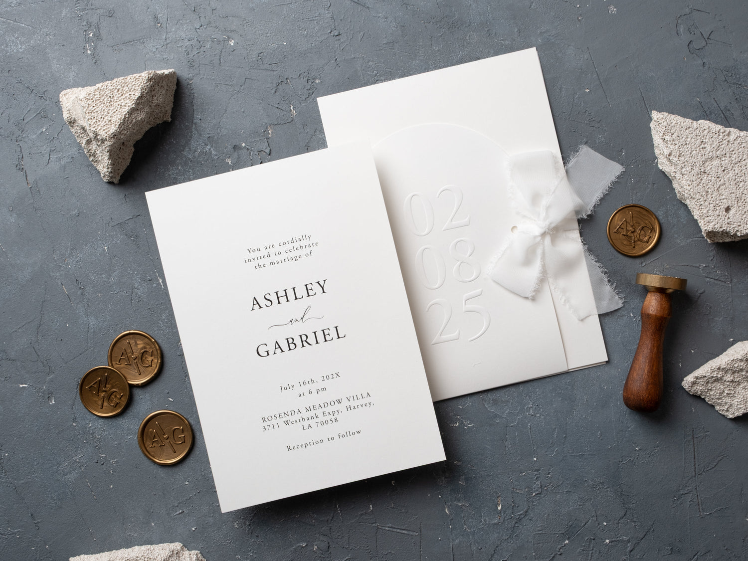
In short: Embossed wedding invitations add depth you can feel, making a simple layout look more intentional without relying on heavy color or large graphics. Embossing works best when the design has open space, clear wording, and a material choice that supports the raised detail. Use it to emphasize names, monograms, borders, or a subtle pattern.
Embossing changes the surface of a wedding invitation by raising selected lettering or artwork. The effect can be noticed visually, but its real character appears when the card is held. Light falls across the raised areas, creating dimension without requiring a busy illustration or a large amount of color.
That texture can support minimal, classic, botanical, or luxury designs. The most successful embossed invitations use it selectively, leaving enough open space for the names, date, venue, and response details. This guide explains how embossing differs from foil, which layouts suit it, and how to keep a textured suite readable.
What Are Embossed Wedding Invitations?
Embossed wedding invitations use pressure and a shaped die to raise an element above the surface of the card. The raised area might be the couple's names, a monogram, a border, leaves, florals, or a repeating pattern. The reverse side may show a corresponding impression depending on the production method and material.
Embossing does not have to include color. A raised ivory pattern on ivory paper can create quiet detail through shadow alone. It can also be combined with ink or foil when the design needs stronger contrast. Browse embossed wedding invitations to compare restrained patterns, shaped cards, metallic accents, and colored envelopes.
Because the effect depends on the real surface, view close-up product images and request a sample when possible. A screen can show the pattern, but it cannot fully communicate the depth or feel of the finished card.
Why Choose Embossed Details for a Wedding Invitation?
Embossing adds interest without filling the invitation with extra artwork. It is especially useful when you want a minimal palette but do not want the card to feel flat. A raised border can frame the wording, a monogram can create a focal point, and botanical texture can support a garden theme without competing with the text.
The finish also responds to different lighting. Shadows make the raised detail more visible as the card moves, which gives the design dimension while keeping the color scheme controlled. That balance can make embossing suitable for both understated and formal celebrations.
Use it on the element guests should notice first. Embossing every line or covering the entire card can reduce hierarchy. One or two textured features are usually more effective than several unrelated raised motifs.
How Is Embossing Different From Foil Printing?
Embossing changes the shape of the surface. Foil printing applies a reflective finish that catches light through color and shine. Embossing is tactile even when it uses no ink, while foil is recognized primarily by its metallic or contrasting appearance.
The two techniques can be combined. Foil can define the top of raised lettering or highlight selected areas of an embossed pattern. When both are used, keep the layout focused so the texture and reflection support the same focal point rather than competing.
If shine matters more than raised texture, compare foil printed wedding invitations. If you prefer depth that remains subtle, a blind or tone-on-tone embossed design may be the better fit.

Which Designs Work Best With Embossed Texture?
Simple layouts give embossing room to be seen. A centered name treatment, spacious border, or one botanical motif can create a clear focal point. Shaped cards such as arches can add another layer of structure, but the outline and raised design should feel related rather than decorative for separate reasons.
Classic suites often use ivory, white, black, or metallic accents. Botanical designs can emboss leaves or florals around the wording. Modern invitations may use an abstract pattern, clean monogram, or raised geometry. The finish can also appear on an outer jacket while the inner card carries the main information.
Look for a design that still reads clearly when the texture is viewed in softer light. Deep detail can be beautiful in a close-up photograph, but the names and date must remain the primary information.

How Do You Keep Embossed Invitation Wording Readable?
Separate decorative texture from essential text. Names or a short monogram can carry more detail, while the date, time, venue, and response instructions should use a clear typeface and dependable contrast. Avoid placing fine wording directly over a busy raised pattern.
Use enough spacing around each information group. Embossing adds shadows and visual movement, so crowded lines can become harder to scan even when the print color is strong. A limited number of type styles will help the hierarchy remain clear.
Review a proof at the finished size. If possible, assess a physical sample under natural and indoor light. Confirm that the raised design does not distort small letters and that every essential line remains easy to read without relying on one viewing angle.
Can You Pair Embossing With Foil or Acrylic?
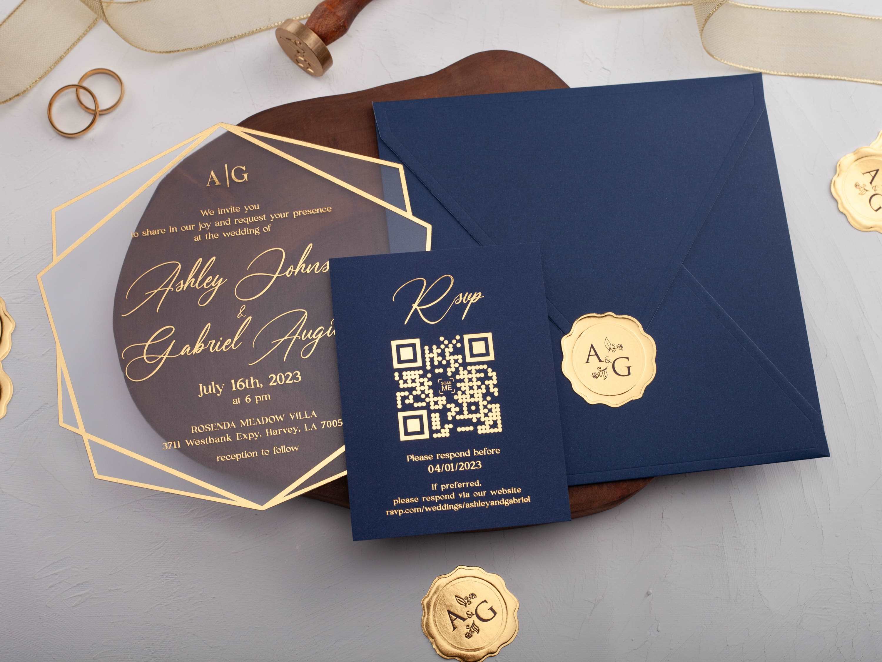
Embossing pairs naturally with foil when both techniques emphasize the same element. A raised gold monogram or a foil-touched border can add texture and reflection without requiring a complex palette. Keep supporting copy simple and let the combined finish become the focal point.
Traditional embossing is most commonly associated with paper and card surfaces that can hold a raised impression. Acrylic designs may use layered embossed jackets, paper inserts, or separate textured components rather than embossing the rigid acrylic card itself. Confirm the construction shown in the product listing before ordering.
For a broader comparison of premium materials and presentation formats, explore luxury wedding invitations.
How Do You Choose an Embossed Wedding Invitation Design?
Begin with the role of texture. Decide whether it should frame the invitation, highlight the names, introduce a monogram, or add a botanical pattern. One clear purpose makes the design easier to personalize and keeps the wording at the center.
Next, choose the amount of contrast. Tone-on-tone embossing feels quiet and tactile. Ink or foil makes the raised element more visible. Colored envelopes, jackets, or ribbons can connect the invitation to the wedding palette without adding more detail to the card itself.
Finally, check the finished components, personalization choices, and mailing format on the product listing. Order a sample when possible and evaluate the actual texture, paper weight, print contrast, and complete suite. Explore our embossed wedding invitations to find a personalized design that adds dimension while keeping every important detail clear.
Frequently Asked Questions About Embossed Wedding Invitations
What does embossed mean on a wedding invitation?
Embossing creates a raised design or lettering detail that adds tactile depth to the invitation.
Are embossed wedding invitations formal?
They can be. A clean layout, refined type, and restrained texture can make embossing feel elegant and formal.
Is embossing the same as foil printing?
No. Embossing creates physical raised texture, while foil printing adds a reflective metallic finish. They can be used together when the design stays readable.
Can embossed text be easy to read?
Yes. Use comfortable type sizes, good contrast, and enough space around names, dates, and venue details.
Which styles suit embossed invitations?
Minimal, classic, botanical, luxury, and modern suites can all use embossing when the pattern supports the overall design.
Should every detail be embossed?
No. Use embossing selectively on names, a monogram, a border, or one pattern so the invitation remains balanced.
Explore our embossed wedding invitations to compare personalized textures, shapes, colors, and foil details.

Leave a comment
This site is protected by hCaptcha and the hCaptcha Privacy Policy and Terms of Service apply.