
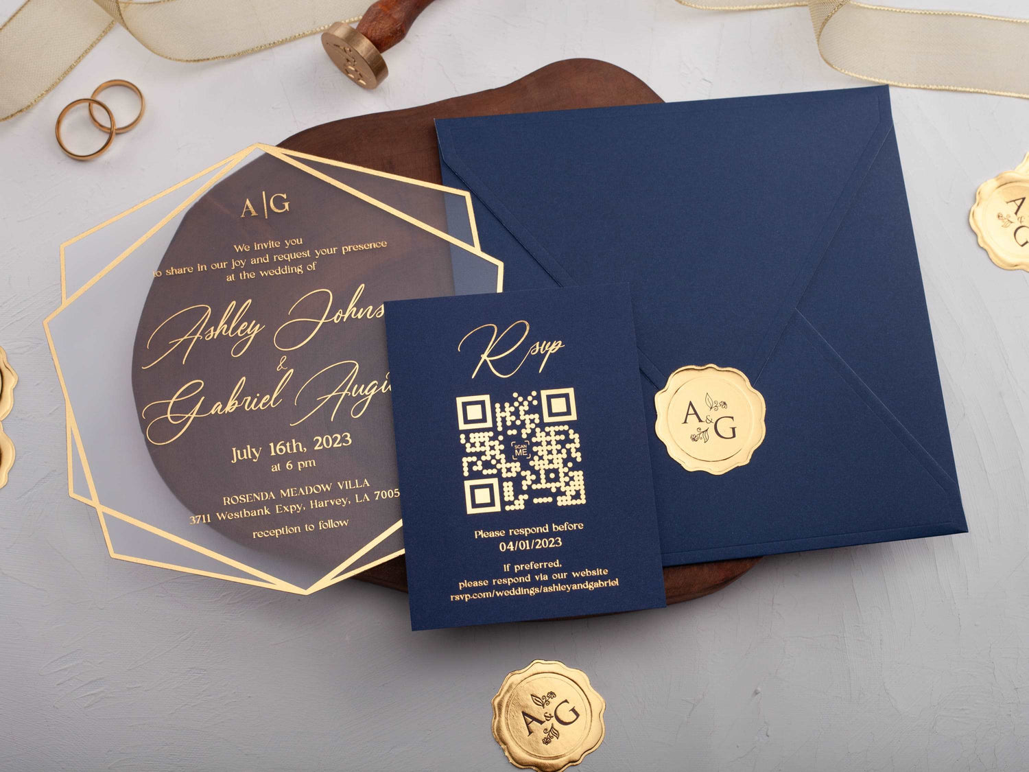
In short: Navy blue wedding invitations feel classic and versatile because the deep color gives names and details strong contrast. Choose gold accents for warmth and evening formality, or silver for a cooler, modern finish. A focused palette, clear type, and intentional material choice will keep the suite polished rather than busy.
Navy blue gives wedding stationery the depth of black with a softer, more colorful finish. It can frame pale paper, become the background for metallic lettering, or appear as a jacket around acrylic. Because it works with both warm and cool accents, navy can move from traditional to modern without losing its formal character.
The main finish decision is often gold or silver. Gold warms the palette and creates a celebratory glow. Silver gives navy a crisp, cooler contrast. This guide compares those options and explains how typography, season, material, and presentation affect the finished invitation.
Why Are Navy Blue Wedding Invitations So Versatile?
Navy is dark enough to create clear structure but less severe than pure black. White, ivory, metallic, and pale blue lettering can all stand out against it. The color also pairs naturally with formal typography, botanical artwork, modern shapes, and travel-inspired formats.
It can be used as a full background or a supporting layer. A navy jacket makes a clear acrylic card easier to read, a navy envelope gives an ivory invitation stronger contrast, and navy artwork can anchor a light paper design. Browse navy blue wedding invitations to compare those different uses.
The key is to decide whether navy is the main statement or the frame. If it covers the invitation, keep the wording and artwork focused. If it appears only on the envelope or jacket, the inner card can carry more texture, transparency, or metallic detail.
Should You Pair Navy Blue Invitations With Gold or Silver?
Choose gold when you want warmth. Gold foil against navy can feel classic, evening-focused, and celebratory. It works especially well with ivory, champagne, burgundy, blush, or rich green accents. Use it on names, a monogram, a border, or one illustration so the metallic finish has a clear role.
Choose silver when you want a cooler, cleaner effect. Silver pairs naturally with white, gray, pale blue, and winter palettes. It can make a navy suite feel modern without removing its formality. The reflective contrast is often strongest when the surrounding layout remains simple.
Both finishes can work in the same broad wedding style. Let the jewelry, venue details, table accents, and preferred neutrals guide the choice. If you want to compare metallic treatments across more materials, explore foil printed wedding invitations.
How Can Navy and Gold Invitations Feel Formal?
Formal navy-and-gold stationery depends on proportion. Let navy create the foundation, then use gold to guide the eye toward the couple's names or another focal point. Large areas of metallic artwork can compete with the wording, while a focused border, monogram, or heading feels intentional.
Structured presentation also adds formality. A folded jacket, layered card, ribbon, or fitted envelope creates a clear opening sequence. Refined typography and consistent spacing matter just as much as the metallic finish, especially when the invitation includes several lines of venue or reception information.
Compare gold foil printed wedding invitations to see how warm metallic details work across dark and light designs.

Which Wedding Seasons Suit Navy Blue Stationery?
Navy works throughout the year because the supporting colors can change. For spring, add white, blush, or fresh botanical details. In summer, pair navy with crisp white, pale blue, or lighter florals to keep the suite open and bright.
Autumn palettes can combine navy with burgundy, terracotta, or warm gold. Winter suites can use silver, white, gray, or deep green for a cooler, more dramatic effect. The navy itself does not need to change; the metallic finish and accent colors carry most of the seasonal mood.
How Do You Keep Wording Clear on a Dark Invitation?
Use strong contrast and comfortable type sizes. White, ivory, gold, and silver can all read well on navy when the lettering is not too thin. Decorative scripts are best reserved for names or short headings, while dates, addresses, and response information benefit from a simpler typeface.
Leave open space around important lines. A dark background already has visual weight, so dense florals, multiple borders, and several type styles can make the design feel crowded. Build hierarchy by choosing one main metallic or light color and one supporting accent.
Review a printed or physical proof whenever possible. Screen color and metallic simulations cannot fully show contrast, reflection, or the way the invitation looks under changing light.
Can Navy Blue Work With Foil or Acrylic Invitations?
Yes. Navy can appear directly on acrylic, behind a clear card, or as a jacket or envelope. The transparent material lets navy create contrast beneath the wording, while gold or silver foil provides a reflective focal point. This combination can feel modern and formal at the same time.
With acrylic wedding invitations, check the complete layer order. White or metallic wording may look different over a navy jacket than it does over a light surface. Keep the inner card simple if the outer layer already includes detailed artwork or a strong shape.
Silver can be especially effective when you want the acrylic and navy to feel cool and architectural rather than warm and traditional.

How Do You Choose the Right Navy Blue Design?
Start with the wedding mood. Choose navy and gold for warmth, evening formality, or a classic celebratory finish. Choose navy and silver for a cooler, modern, or winter-focused palette. If neither metallic finish is central to the design, white or ivory typography can create a quieter result.
Then consider the wording. Longer text needs a cleaner layout and dependable contrast. Short formal wording can support a larger monogram, shaped card, or decorative border. Confirm that the names, date, time, and venue remain easy to scan after every design element is added.
Finally, review the product's available materials and personalization options because components vary by listing. Explore our navy blue wedding invitations to compare personalized designs with gold, silver, acrylic, paper, folded, and travel-inspired details.
Frequently Asked Questions About Navy Blue Wedding Invitations
Do navy blue wedding invitations look formal?
Yes. Navy can feel especially formal when paired with refined typography, metallic details, and a simple layout.
Is gold or silver better with navy blue invitations?
Gold adds warmth and a classic evening feel, while silver creates a cooler, more modern contrast. Both can work well.
Can navy blue invitations work for a summer wedding?
Yes. Pair navy with white, light blue, or soft florals to make the palette feel fresh for summer.
How do you make navy invitation wording readable?
Use high-contrast ink or foil, clear type size, and generous spacing around important details.
Does navy blue work with acrylic invitations?
Yes. Navy artwork or foil can create strong contrast on acrylic, especially when the wording is kept simple.
Should the whole suite be navy blue?
Use navy as the anchor, then add white, ivory, metallic, or soft accent colors so each piece remains easy to read.
Explore our navy blue wedding invitations to compare personalized gold, silver, acrylic, and paper designs.

Leave a comment
This site is protected by hCaptcha and the hCaptcha Privacy Policy and Terms of Service apply.