
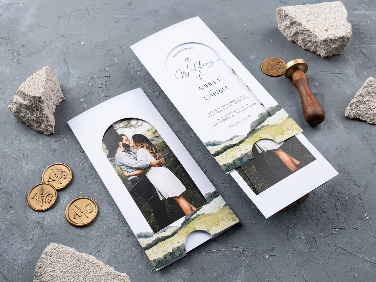
Sliding wedding invitations turn opening the card into part of the experience. A photo or short message draws guests in, then the inner card reveals the celebration details. The format works best when that movement supports a clear reading order. This guide helps you plan the reveal, choose a readable photo layout, and decide which details need space of their own.
In short: Sliding wedding invitations create a reveal as guests pull the inner card from its sleeve. Keep the first visible message simple, place essential wording where it can be read after opening, and choose a photo with clear focal space. Plan the closed size and supporting details before adding extra layers.
How does a sliding wedding invitation reveal work?
A sliding invitation uses an inner card that moves out of an outer sleeve or holder. That motion changes what the guest sees. The closed view introduces the design, while the open view reveals the message. Think of them as two related layouts, rather than one layout with part of the text covered.
Start by deciding what should appear first. Your photograph, names, or a short opening line can provide that first cue. Place the complete invitation message where guests can read it after pulling the card. The Photo Slide Wedding Invitation uses a photograph on the front and an inner card that reveals the event details. Review both views together when comparing designs.

Keep the movement simple enough to understand without a long explanation. Ask someone who has not seen the design to open a sample and read it. If they miss an important line or hesitate over the opening direction, adjust the placement before adding more decoration. Browse sliding wedding invitations with that full opening sequence in mind.
What should guests see before pulling the card?
The closed view should make the invitation feel welcoming and easy to recognize. You do not need to show every detail at once. A photograph, the couple's names, or a brief invitation cue can give the guest enough context to begin. Choose one main focal point so the first view feels deliberate, not unfinished.
Avoid placing a critical detail halfway across an area that the sleeve covers. A partially hidden venue name or date can look like an error even if the full line appears after opening. Review the exact closed position shown in the proof. Leave a little visual space around the visible wording so it does not appear crowded against an edge.
Repeat one design feature between the closed and open views. It might be a typeface, a color, or a small motif. This creates continuity without copying the entire front layout onto the inner card. Keep any opening instruction short and natural. The aim is for guests to understand that there is more to reveal while still enjoying the first impression.
Where should a couple's photo sit in the design?
Choose the photograph with the final card layout in mind. A picture that looks wonderful on your phone may need a different crop for an invitation. Look for a clear focal point and enough calm space around the couple. Faces should stay visible in the closed view, rather than disappearing beneath the holder or a line of text.
Check the crop at the actual proportions of the selected design. Do not rely only on a square social-media preview. If wording sits over the image, choose an area with gentle changes in tone so the letters remain clear. A busy background can compete with names and dates. Ask for a proof that shows the photo and wording together before deciding that the image works.
Compare other photo wedding invitations to see how image placement changes the reading order. A photo can introduce the couple without carrying every practical detail. Let the inner card handle the longer message when that keeps the front clearer. Use the image resolution requested by the seller, and avoid stretching a small file to fit a larger print area.
How can you keep names and dates readable?
Give the wording a clear order before choosing fonts. Guests should find the couple's names, invitation message, date, time, and venue without searching through the design. The names can be expressive, but the practical information needs a simple, readable treatment. A sliding format already adds movement, so the text does not need several competing styles.
Use one decorative typeface with a clear companion rather than combining several scripts. Review thin strokes, small punctuation, and the spacing between letters at the finished size. A line that looks elegant in a large digital proof may be difficult to read on the card. Check the date and time especially carefully, including any abbreviations that could confuse guests.
Make the open view readable on its own. Once the inner card is pulled out, the essential details should form a complete message. Avoid making guests move the card back and forth to connect separate parts of a sentence. If the text feels tight, shorten it or move supporting information to an insert. Do not shrink every line just to keep an extra decorative border.
Which details belong on the inner card or a separate insert?
The inner card should carry the essential invitation: who is getting married, what guests are invited to, and when and where it happens. Keep that message complete and easy to find. Longer travel advice, a detailed schedule, or several event locations may need more room than the main card can comfortably offer.
Group supporting details by purpose. A short note about the reception can sit with the main wording if it remains clear. A longer timeline or travel explanation may work better on a separate piece or your wedding website. Use descriptive labels so guests know which information they are reading. An insert should solve a space problem, not add another layer simply because the format allows it.
Check which pieces are actually included in the selected listing before planning the complete suite. Do not assume that a sleeve, reply card, or extra insert comes with every option. Review the fully assembled invitation too. Added layers change how it fits inside the mailing envelope. Confirm the finished size, thickness, and postage needs with the seller and relevant postal service rather than guessing from the main card alone.
How do sliding, folded, and gatefold formats differ?
A sliding invitation reveals its inner card through a pulling motion. A folded invitation opens along a crease and can spread the message across panels. A gatefold design opens from two side panels toward the center. Each creates a different reading sequence. Choose the format that supports your wording and photo, rather than treating the opening effect as the only feature that matters.
If you want a photograph to introduce the design and the event details to appear afterward, a sliding layout may suit that plan. If a timeline or longer message needs a visible panel structure, compare folded wedding invitations. The Folded Wedding Invitation with Photo and Timeline is a useful visual reference for that different approach. Its layout should not be mistaken for a sliding mechanism.

Review the closed and open views of your preferred options using the same wording. Check the reading order, handling, and space for supporting details. Explore the broader wedding invitations collection when comparing formats, then return to the design that makes your message feel most natural. A clear invitation is still the goal, whichever opening style you choose.
Explore our sliding wedding invitations and compare photo-led formats to find a reveal that keeps your celebration details easy to read.
What else should you know before choosing sliding invitations?
What is a sliding wedding invitation?
It uses an inner card and sleeve so the invitation is revealed as the guest pulls the card outward.
Should the invitation wording be hidden by the sleeve?
The full wording can sit on the inner card, but a visible name, date, or opening cue helps guests understand the design before pulling it.
Can sliding invitations include a photograph?
Yes. Choose a photo with a clear focal point and enough quiet space to keep wording readable.
Are sliding invitations the same as pocket invitations?
No. A sliding design reveals a moving inner card; a pocket format mainly holds the invitation and additional pieces together.
Where should venue and schedule details go?
Keep essential venue information on the invitation and use a separate insert when the schedule needs more space.
How should you check a sliding layout before ordering?
Review the closed and open views, confirm the reading order, and check the finished size and included pieces with the listing or seller.

Leave a comment
This site is protected by hCaptcha and the hCaptcha Privacy Policy and Terms of Service apply.