
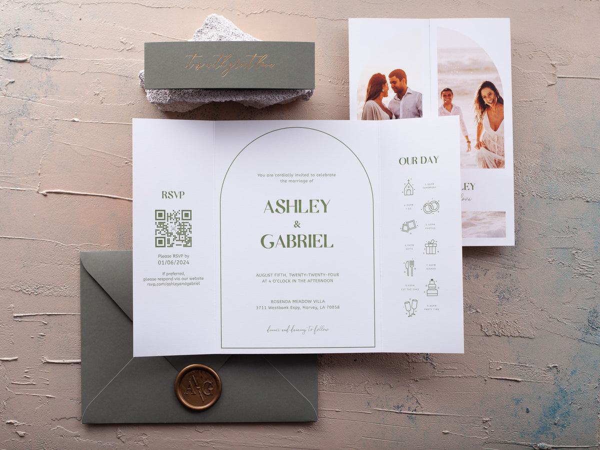
A photograph can turn your wedding invitation into a personal keepsake, but the image must work with the card rather than compete with the wording. Resolution, orientation, crop, background, and format all affect the final result.
This guide helps you choose a picture that prints clearly, fits the layout, and leaves guests with an invitation that feels polished and recognizably yours.
In short: Choose a sharp, well-lit photo with enough open space for text and a crop that still works at invitation size. Match the picture’s orientation to the layout, avoid busy backgrounds behind wording, and order a proof before production. The best image supports the invitation rather than competing with its essential details.
What Makes a Photo Suitable for a Wedding Invitation?
Start with the highest-resolution original you have. Screenshots, messaging-app downloads, and social-media copies are often compressed and may look soft when printed. A suitable photo should also have balanced light, natural skin tones, and enough space around faces for trimming or folding. Ask your photographer for a print-ready file when possible.
The composition matters as much as the file size. A busy background can make names and details difficult to read. Look for open sky, a calm wall, water, foliage, or another even area that can hold wording. If the best image is visually dense, place it on one panel and keep the invitation text on another. Browse our photo wedding invitations to see how different formats separate or combine picture and wording.
Should You Use a Close-Up or a Full-Length Engagement Photo?
A close-up creates emotional connection and keeps faces recognizable at a small printed size. It works well on flat cards, framed panels, and designs where the image is the main visual element. A full-length photograph gives more context and can show a landscape, venue, or outfit, but the couple may become too small if the invitation uses a narrow crop.
Choose according to the space available. If the card includes text over the image, a wider composition with open background is useful. If the photograph sits alone on a flap or interior panel, a closer portrait can fill the area without competing with details. Keep important features away from edges, folds, wax seals, and belly bands.

How Do Portrait and Landscape Photos Change the Layout?
Portrait photographs fit tall invitation faces and leave room above or below the couple for short wording. Landscape images suit wide panels, gatefold interiors, and designs that show scenery. A square crop can work for centered layouts, but it may remove context from the original photograph.
Match the image orientation to the invitation before committing to a crop. Rotating a landscape photo into a narrow portrait space usually forces you to cut away people or background details. A folded design can solve this by placing the photograph on one side and the wording on the other. The folded wedding invitations collection provides more panel space when a single flat face feels crowded.
Where Should Wording Sit When the Invitation Includes a Picture?
Place wording over an area with consistent tone and strong contrast. Light type needs a dark, calm background; dark type needs a light area without bright highlights. Avoid running essential details across faces, detailed clothing, or strong horizon lines. If no part of the photo offers enough visual quiet, use a separate text panel instead of forcing an overlay.
Keep the hierarchy clear: names, date, time, and venue should be immediately visible. Supporting details can move to an insert or interior panel. Generous margins help both the picture and the wording feel intentional. Premium paper wedding invitations can also improve image reproduction when the surface is chosen for photographic detail.
How Can You Make Sure the Photo Prints Clearly?
Use the original image file and confirm that it remains sharp at the final print dimensions. Avoid heavy filters that flatten skin tones or create visible banding. Brighten dark images carefully, because lifting shadows too far can reveal noise. Your screen emits light, while paper reflects it, so a photograph often prints slightly darker than it appears on a phone.
Order a physical proof and inspect faces, hair, clothing, and fine background details. Check color under daylight and indoor light. Make sure the crop respects trim and fold lines, and verify that any text overlay remains readable. A proof is especially important for black-and-white photographs, deep shadows, and images with subtle warm or cool tones.
Which Invitation Formats Give a Photo the Most Space?
A flat invitation works when one strong picture and concise wording can share the face. Folded, gatefold, and trifold formats create separate areas for the photograph, formal invitation details, schedule, and response information. Sliding formats reveal the message through movement and can make the picture feel more interactive.
Choose the format based on how much information you need and how prominently the photo should appear. A multi-panel card is useful when you want a large image without placing text over it. Keep the complete mailed suite in mind, including thickness, envelope size, and postage. Compare the full range through our wedding invitations collection before deciding.

Find a layout for your favorite picture in our photo wedding invitations, then compare crops, panels, and formats before approving your design.
Frequently Asked Questions
What photo resolution is best for a wedding invitation?
Use the highest-resolution original available rather than a screenshot or compressed social-media copy. Confirm that it remains sharp at the final print size.
Should a wedding invitation photo be portrait or landscape?
Either can work. Choose an orientation that matches the invitation format and leaves enough space for names, date, venue, and other essential wording.
Can text be placed directly over a photo?
Yes, when the image has a calm, evenly toned area with strong contrast. Otherwise, place wording in a separate panel or use a subtle overlay.
Is a color or black-and-white photo better?
Both are effective. Color can reinforce your palette, while black and white reduces visual competition and often pairs easily with formal typography.
How should a photo be cropped for an invitation?
Keep faces and important details away from trim and fold lines. Leave breathing room around the couple so the crop remains balanced after production.
Should you order a proof before printing photo invitations?
Yes. A proof lets you check skin tones, sharpness, contrast, crop, and wording size before the full order is produced.

Leave a comment
This site is protected by hCaptcha and the hCaptcha Privacy Policy and Terms of Service apply.