
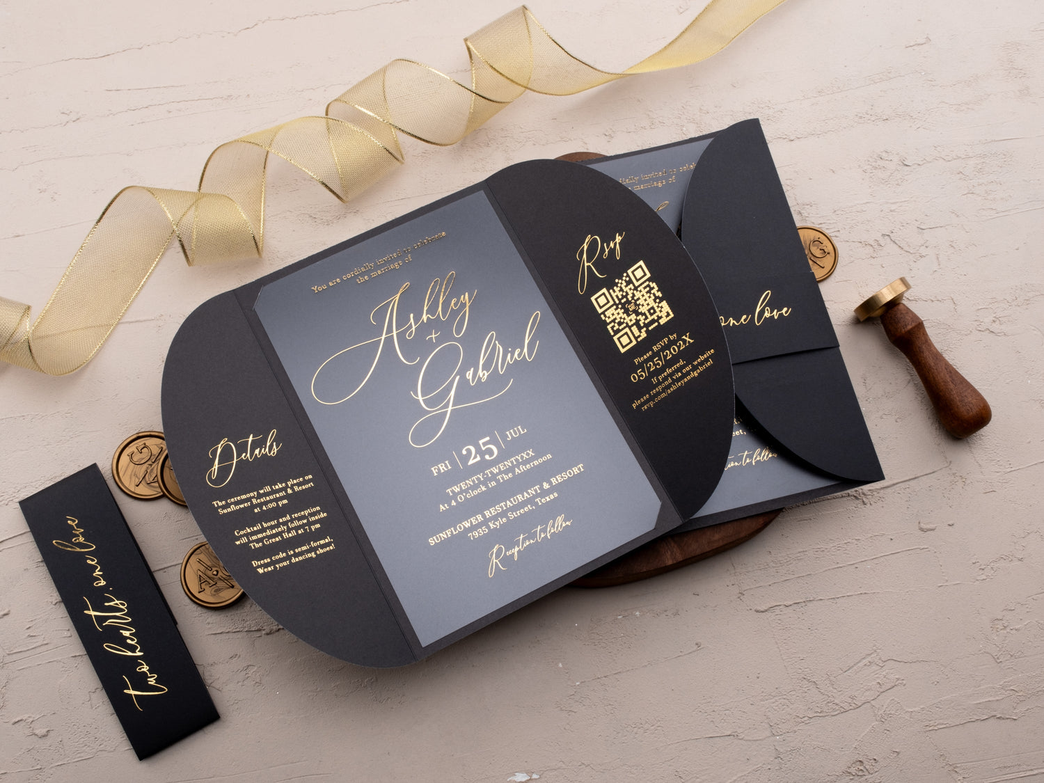
Gold can make wedding stationery feel warm, formal, modern, or romantic. The result depends less on using as much gold as possible and more on choosing the right printing method, color pairing, material, and typography.
This guide explains how to compare reflective foil, metallic ink, and printed gold color so you can select a finish that supports your wording and wedding style.
In short: Choose gold wedding invitations by deciding whether you want reflective foil, softer metallic ink, or gold used only as a color accent. Pair the finish with a readable type size, a restrained palette, and paper or acrylic that keeps details crisp. A proof helps confirm shine, contrast, and legibility in real light.
Should You Choose Gold Foil, Metallic Ink, or a Printed Gold Color?
Gold foil creates the strongest reflection because a metallic film is pressed onto the invitation surface. It works especially well for names, monograms, borders, and short lines that should catch the light. Metallic gold ink produces a softer sheen and can suit designs that need a gentler finish. A flat printed gold color does not reflect in the same way, but it gives you more freedom with gradients, fine artwork, and larger areas of color.
Start with the effect you want guests to notice. Choose foil for tactile shine and formal emphasis. Choose metallic ink for a quieter glow. Use printed gold as an accent when the layout, illustration, or budget matters more than reflectivity. You can compare these approaches across our gold foil wedding invitations and the wider foil printed wedding invitations collection.
Which Colors Pair Best With Gold Wedding Invitations?
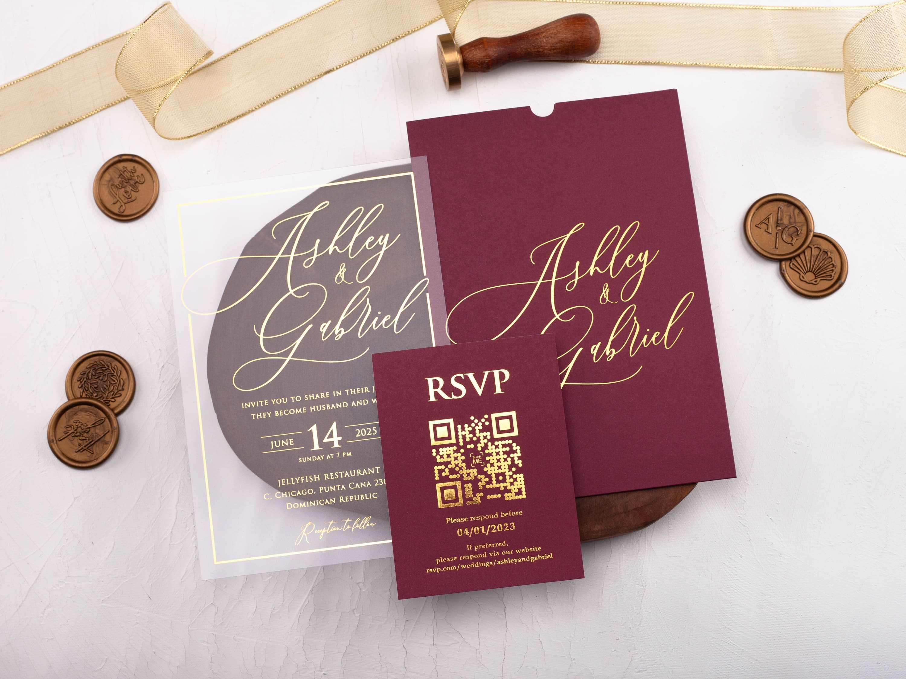
Black and gold creates high contrast and a formal evening look. Ivory and gold feels lighter and more traditional. Burgundy, emerald, and navy add depth for fall, winter, or ballroom celebrations, while blush and warm beige soften the metallic detail for romantic settings. The best pairing is the one that connects to your venue and keeps every essential line easy to read.
Use one dominant background color, one neutral, and gold as the finishing detail. This keeps the suite coordinated without making every piece visually heavy. If the envelope or jacket carries a deep color, the invitation card can stay lighter. If the card itself is dark, use gold for names and selected details instead of compressing all wording into reflective type.

Does Gold Look Better on Paper or Acrylic Invitations?
Paper gives gold foil a familiar stationery feel and offers many textures, weights, and soft neutral colors. Smooth paper keeps small details crisp, while textured stock adds character but may require bolder foil lines. Acrylic creates a more contemporary effect because metallic lettering appears to float over a clear, frosted, black, or colored panel.
Choose the material according to the complete suite, not the card alone. Paper is easier to coordinate with inserts and traditional envelopes. Acrylic can feel more architectural and works well with jackets or backing layers that increase contrast. Review the product details for available printing methods because not every foil technique suits every surface. If you are comparing a dramatic dark palette, our black and gold wedding invitations show how material and contrast work together.

Which Fonts Remain Readable With a Reflective Gold Finish?
Reflective finishes change as the card moves, so type needs enough size, spacing, and stroke weight to remain clear in different light. Use a clean serif or sans-serif for venue, time, address, and response details. A script can add personality to names or a short heading, but long script paragraphs and very fine strokes are harder to read when the foil catches light.
Build hierarchy before adding decoration. Names should be easy to find, followed by date and location. Supporting details can be smaller, but they still need comfortable spacing. Ask for a proof at the final size rather than judging typography only on a large screen. If the layout already includes a monogram, border, or floral artwork, keep the remaining type simple so each element has a clear job.
How Much Gold Should a Formal Invitation Design Use?
A formal invitation does not need gold on every line. One strong metallic feature often feels more refined than several competing effects. Use foil on names, a crest, a border, or a jacket detail, then let the background color and typography establish the rest of the mood. Repeating a small gold element on an insert or envelope can connect the suite without making it look uniform.
Consider where the invitation will be viewed. Strong reflection can be beautiful in hand but distracting behind dense wording. Leave open space around metallic elements and keep decorative patterns away from essential information. This approach also helps a modern design feel intentional: gold becomes a focal point rather than a default treatment applied everywhere.
What Should You Check on a Proof Before Approving the Order?
Review the proof for spelling, date, time, venue, response details, and the order of every enclosure. Then inspect the physical qualities that a screen cannot fully show: foil coverage, alignment, edge definition, color accuracy, and contrast. Look at the invitation in daylight and indoor light because reflectivity can change significantly.
Confirm the crop and safe area around borders or monograms. Check whether small letters fill in or thin strokes disappear. Assemble one complete suite with its jacket, inserts, and envelope so you can assess thickness, weight, and mailing requirements. A careful proof protects both the visual finish and the practical information guests need.
Ready to compare finishes? Explore our gold foil printed wedding invitations to review paper, acrylic, passport, folded, and gatefold designs before choosing your suite.
Frequently Asked Questions
What is the difference between gold foil and metallic gold ink?
Foil is pressed onto the surface and reflects light more strongly. Metallic ink is printed and usually creates a softer sheen with less dimensional contrast.
Which colors look best with gold wedding invitations?
Ivory, black, navy, burgundy, emerald, blush, and warm neutrals all pair well with gold. Choose a combination that suits the venue and keeps wording readable.
Is gold foil suitable for small invitation text?
It can be, but very thin strokes and tiny type may lose clarity. Use comfortable type sizes and reserve delicate scripts for short names or headings.
Does gold foil work on acrylic invitations?
Yes. Gold foil or metallic printing can create strong contrast on clear, frosted, black, or colored acrylic when the surface and production method are compatible.
Can gold wedding invitations look modern?
Yes. Combine restrained gold detail with clean typography, geometric shapes, and generous spacing instead of ornate decoration on every element.
Should you order a proof of a gold invitation?
Yes. Review the proof in daylight and indoor light to check reflectivity, contrast, foil coverage, alignment, and the readability of small details.

Leave a comment
This site is protected by hCaptcha and the hCaptcha Privacy Policy and Terms of Service apply.