
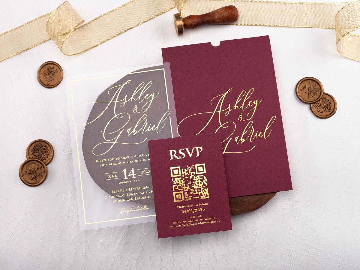
Burgundy gives a wedding invitation depth, warmth, and a strong sense of occasion. The color can feel romantic, formal, modern, or seasonal depending on the neutrals, metallics, typography, and materials placed beside it.
This guide explains how to build a balanced burgundy palette, choose a readable finish, and coordinate the invitation with the wider look of your celebration.
In short: Burgundy wedding invitations pair naturally with warm metallics, soft neutrals, and selected jewel tones. Gold creates a formal look, ivory softens the palette, blush adds romance, and deep green or navy brings contrast. Match the finish and typography to your venue, season, and overall level of formality.
Which Colors Pair Best with Burgundy Wedding Invitations?
Ivory, warm white, and champagne soften burgundy and give the palette room to breathe. These neutrals are dependable choices for wording cards, inserts, or envelopes because they preserve a formal look without adding another strong color. Beige and taupe create a more tonal, understated result.
Blush and dusty rose bring out burgundy's romantic side. Use the lighter pink as a supporting layer or floral detail rather than matching every piece. Forest green creates a rich botanical contrast, while navy gives the palette a structured evening feel. Terracotta and muted rust can make burgundy feel warmer and more relaxed.
Choose one neutral and one accent before adding a metallic. A limited palette makes the main color look intentional and protects the wording hierarchy. Browse burgundy wedding invitations to compare how the same deep tone changes across acrylic, folded, passport, and sleeve formats.
Should You Choose Gold, Rose Gold, or Silver Foil with Burgundy?
Yellow gold is the classic partner for burgundy. Its warmth reinforces the red undertone and creates a formal, celebratory contrast. Use it for names, a crest, a fine border, or selected headings so the reflective finish establishes a focal point rather than covering every line.
Rose gold gives the palette a softer, more tonal direction. It works especially well with blush, mauve, or warm ivory accents. Silver creates a cooler contrast and can make burgundy feel cleaner and more contemporary, particularly when paired with white, gray, or navy.
Readability matters more than the metallic name. Thin foil may disappear under some lighting, so practical details need enough weight and space. Review the finish on the real stock and under normal indoor light. The burgundy and gold wedding invitations collection shows how warm foil can be used across different layouts.

How Can Burgundy Invitations Work for Each Wedding Season?
For spring, pair burgundy with blush, soft ivory, and restrained greenery. The lighter colors keep the palette fresh while burgundy adds definition. Summer designs can use warm white, champagne, or a clear acrylic layer so the deeper tone appears as an accent rather than a large solid field.
Fall naturally supports burgundy, gold, rust, and muted botanical details. Keep the palette edited so it does not become a collection of every autumn color. In winter, combine burgundy with deep green, navy, black, or a cool metallic for a formal evening mood. Texture can add depth when florals are limited.
Your venue should guide the final mix. An outdoor garden benefits from softer neutrals and organic details, while a ballroom can hold stronger contrast and reflective foil. Use your season as a starting point, not a rule; burgundy works year-round when the supporting colors and materials respond to the setting.

Which Paper and Finish Make Burgundy Look Most Elegant?
Matte paper gives burgundy a rich, stable appearance and reduces glare. Smooth stock supports fine typography, while textured paper can make the design feel softer and more tactile. If the surface is heavily textured, avoid very thin lettering because small strokes may lose clarity.
Acrylic can use burgundy as a jacket, sleeve, pocket, printed layer, or coordinating envelope. This approach adds depth without requiring the main card to be fully dark. Clear acrylic with gold wording and a burgundy layer feels structured and modern; a frosted card creates a softer transition between materials.
Foil, embossing, and layered shapes should each have a purpose. One strong finish often looks more refined than several competing effects. Compare gold foil wedding invitations to see how reflective detail behaves on light, dark, paper, and acrylic surfaces before choosing your combination.
How Do You Keep a Burgundy Palette from Feeling Too Heavy?
Use burgundy where it creates the most impact, then give it visual space. A deep envelope, jacket, border, or single panel can establish the palette while an ivory or clear card carries longer wording. This keeps the suite rich without surrounding every line in dark color.
Make the text hierarchy simple. Use a decorative font for names or a short heading, then set the date, venue, and response details in a clean companion typeface. Light lettering needs enough weight to remain clear on burgundy, especially for small addresses and website information.
Balance also comes from repetition. A small burgundy monogram on an ivory insert can connect the pieces without turning every element into a color match. If the main invitation includes floral artwork, let the remaining cards use quieter typography and more open space.
Which Envelope and Accent Colors Complete the Invitation Suite?
A burgundy envelope creates a strong first impression and works well with ivory, champagne, blush, or clear invitation layers. Ivory and champagne envelopes feel lighter and make dark addressing easy to read. Deep green or navy can be effective when that color already appears in the venue, florals, or wedding party styling.
Addressing should remain practical. Use a high-contrast ink or metallic finish that stays clear in ordinary light, and test long guest names and addresses before approving the full set. If the outer envelope is dark, a lighter liner can add balance when guests open it.
Repeat one recognizable accent across the suite, such as gold names, a burgundy border, or a simple monogram. Coordination does not require every piece to be identical. Browse the full wedding invitations collection if you want to compare burgundy with lighter or cooler palettes before making the final choice.
What Are the Most Common Burgundy Invitation Styling Questions?
What colors go best with burgundy wedding invitations?
Ivory, champagne, gold, blush, dusty rose, forest green, and navy all pair well with burgundy. The best choice depends on your season, venue, and desired level of contrast.
Does gold or silver look better with burgundy?
Gold gives burgundy a warm, classic character, while silver creates a cooler and more contemporary contrast. Choose the metallic that matches your jewelry, décor, and venue lighting.
Are burgundy invitations only suitable for fall weddings?
No. Burgundy works year-round when the supporting palette changes. Pair it with blush or ivory for spring, lighter neutrals for summer, warm gold for fall, and deep green for winter.
Which font colors are easiest to read on burgundy paper?
Ivory, white, gold, and selected light metallics usually create strong contrast. Avoid thin, low-contrast lettering, especially for addresses and RSVP details.
Can burgundy be used in a modern invitation design?
Yes. Use clean typography, simple geometry, and restrained metallic accents to make burgundy feel modern rather than traditional.
Which envelope color should accompany a burgundy invitation?
Burgundy, ivory, champagne, blush, or deep green envelopes can all work. Choose one that repeats an accent in the invitation and keeps addressing easy to read.
Explore our burgundy wedding invitations to compare rich color, metallic details, and formats that fit your celebration.
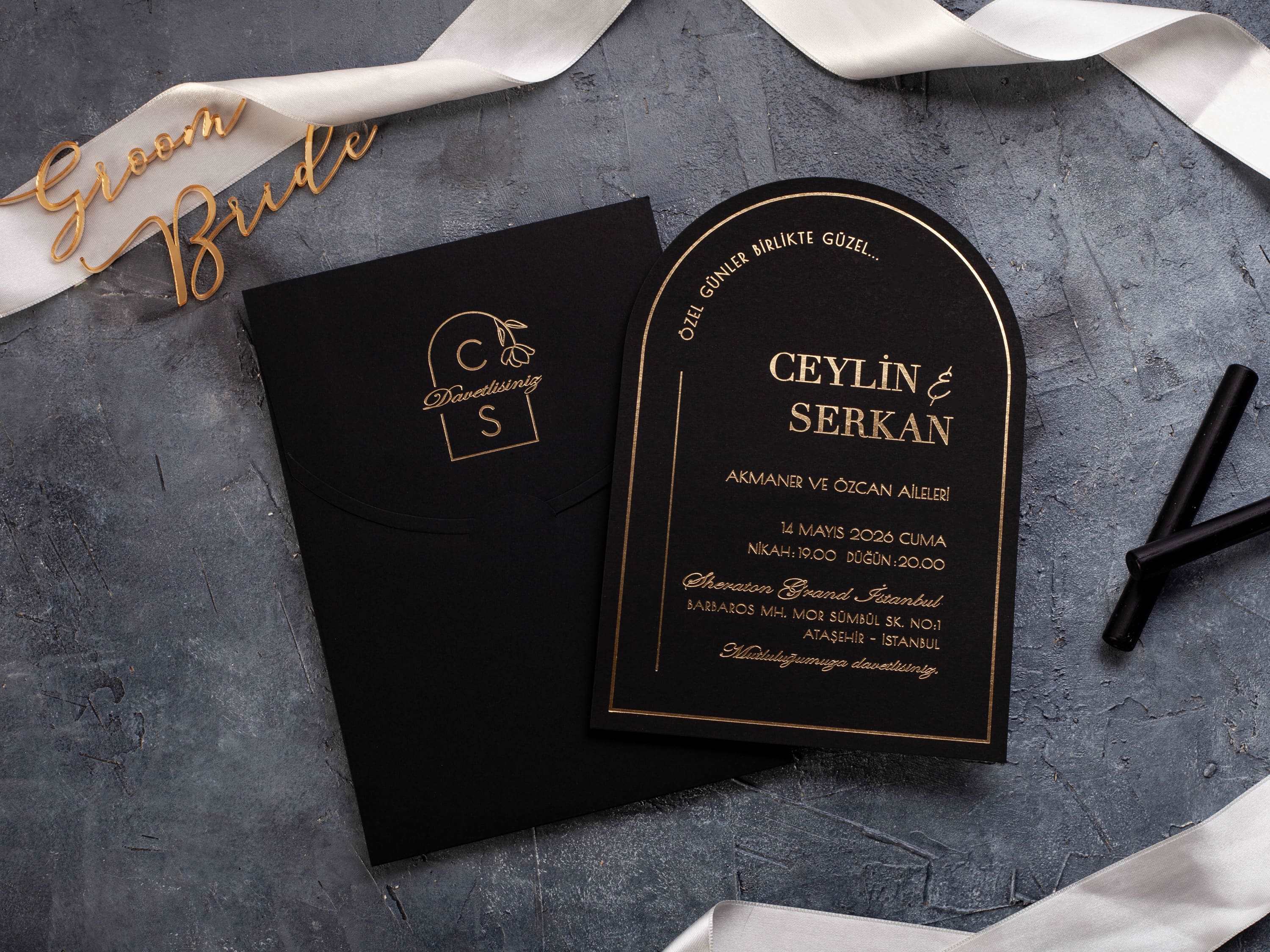
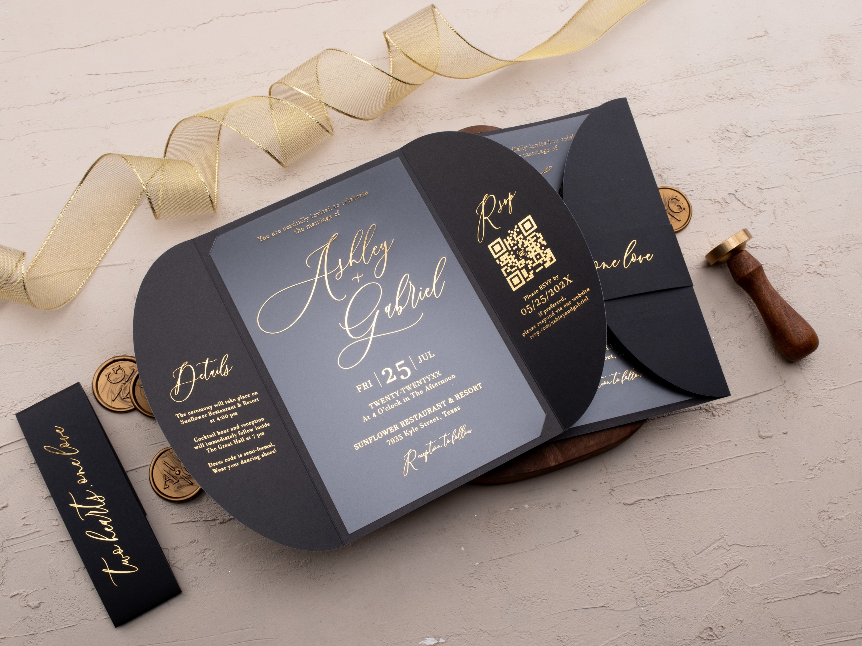

Leave a comment
This site is protected by hCaptcha and the hCaptcha Privacy Policy and Terms of Service apply.