
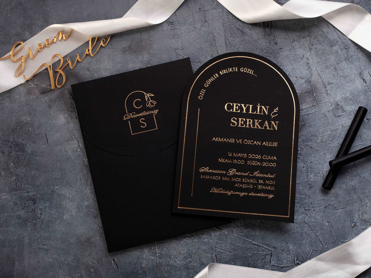
Black wedding invitations can feel formal, modern, or dramatic, but the design only works when guests can read every essential detail without effort. Contrast, type size, spacing, stock, and print method all influence the final result.
This guide explains how to keep a dark invitation elegant and legible while preserving the visual impact that makes black such a distinctive choice.
In short: Black wedding invitations stay readable when contrast, type size, spacing, and print method work together. Use crisp light ink or metallic foil, limit decorative scripts to short names or headings, and leave generous space around essential details. A restrained hierarchy keeps the design dramatic without making guests work to read it.
Which Ink and Foil Colors Are Easiest to Read on Black Invitations?
White and ivory lettering create the clearest light-on-dark contrast. Gold and silver foil can also read well because their reflective surfaces separate the wording from the black background. Rose gold brings a softer warmth, but thin strokes may appear less distinct in dim light, so important details should use a comfortable size and weight.
Do not judge a metallic finish from a flat screen proof alone. Foil changes as the invitation moves, and a color that looks bright under studio lighting may feel quieter at home or at an evening venue. Review a physical proof under daylight and normal indoor light before approving the full order.
Use the strongest contrast for names, date, time, venue, and response information. Dark gray or black-on-black details can work as texture, but they should not carry essential wording. Browse black and gold wedding invitations to see how foil placement and scale affect legibility.

Which Fonts Work Best on a Dark Wedding Invitation?
A clean serif or sans-serif typeface is the safest choice for practical information. These styles keep letter shapes distinct at smaller sizes and make lines such as addresses, dates, and RSVP instructions easier to scan. Choose a font with open counters and enough weight to survive the selected print method.
Decorative scripts can add personality when they are reserved for the couple's names or a short heading. Long script passages, very thin swashes, and tightly connected letters become harder to read on a dark surface. Pair one expressive font with one quieter font rather than combining several decorative styles.
Test the real names and venue details, not only the designer's sample. A typeface that looks graceful with short names may crowd a longer line. Keep capitalization consistent, avoid all caps for long sentences, and confirm that similar characters such as 1, I, and l remain easy to distinguish.

How Much Contrast Does Formal Invitation Wording Need?
Formal wording may be elegant, but it still needs immediate visual separation from the background. Begin with the smallest essential line, often an address or response detail, and make sure it remains clear at arm's length. If that line is readable, larger names and headings will usually be comfortable as well.
Contrast comes from more than color. Letter weight, spacing, surface texture, and foil impression all change how sharply a line appears. A thin gold script on textured black stock may be less readable than a slightly heavier ivory serif on the same card. Embossed or debossed details should support the design rather than replace high-contrast printing.
Separate information into short groups. Give the ceremony date, venue, and response instructions their own breathing room. When every line has the same size and emphasis, guests must work harder to find what matters. A clear hierarchy makes the invitation feel more refined, not less formal.
Where Should Script Typography Be Used and Avoided?
Use script for moments that benefit from emotion and personality: the couple's names, a monogram, or a two- or three-word heading. Keep the lettering large enough for every stroke to print cleanly, and leave room around flourishes so they do not overlap borders or nearby text.
Avoid script for street addresses, website URLs, dates written in numbers, dress codes, and RSVP instructions. These details need fast recognition. Set them in a simple companion typeface and use consistent alignment so the eye can move from one line to the next.
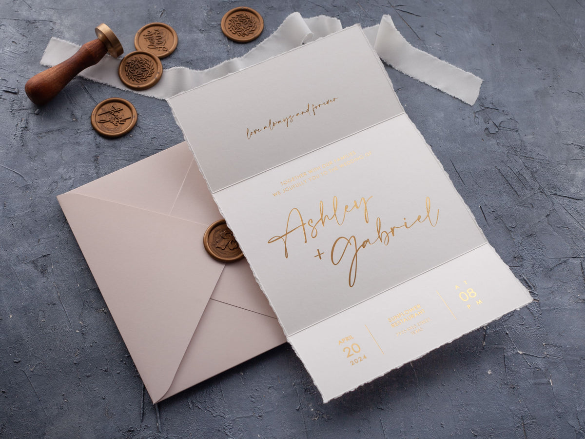
If the invitation includes several panels or inserts, repeat the same font roles throughout the suite. Names should not switch from script to serif without a clear reason, and practical details should maintain the same readable style. The wider foil printed wedding invitations collection can help you compare how typography behaves across dark and light backgrounds.
How Do Paper Finish and Lighting Affect Readability?
Matte black stock usually limits glare and gives light ink or foil a stable background. Glossy and coated surfaces can look sleek, but reflections may cover part of the wording when the invitation is viewed at an angle. Textured paper adds depth, although very fine lines may lose sharpness on an uneven surface.
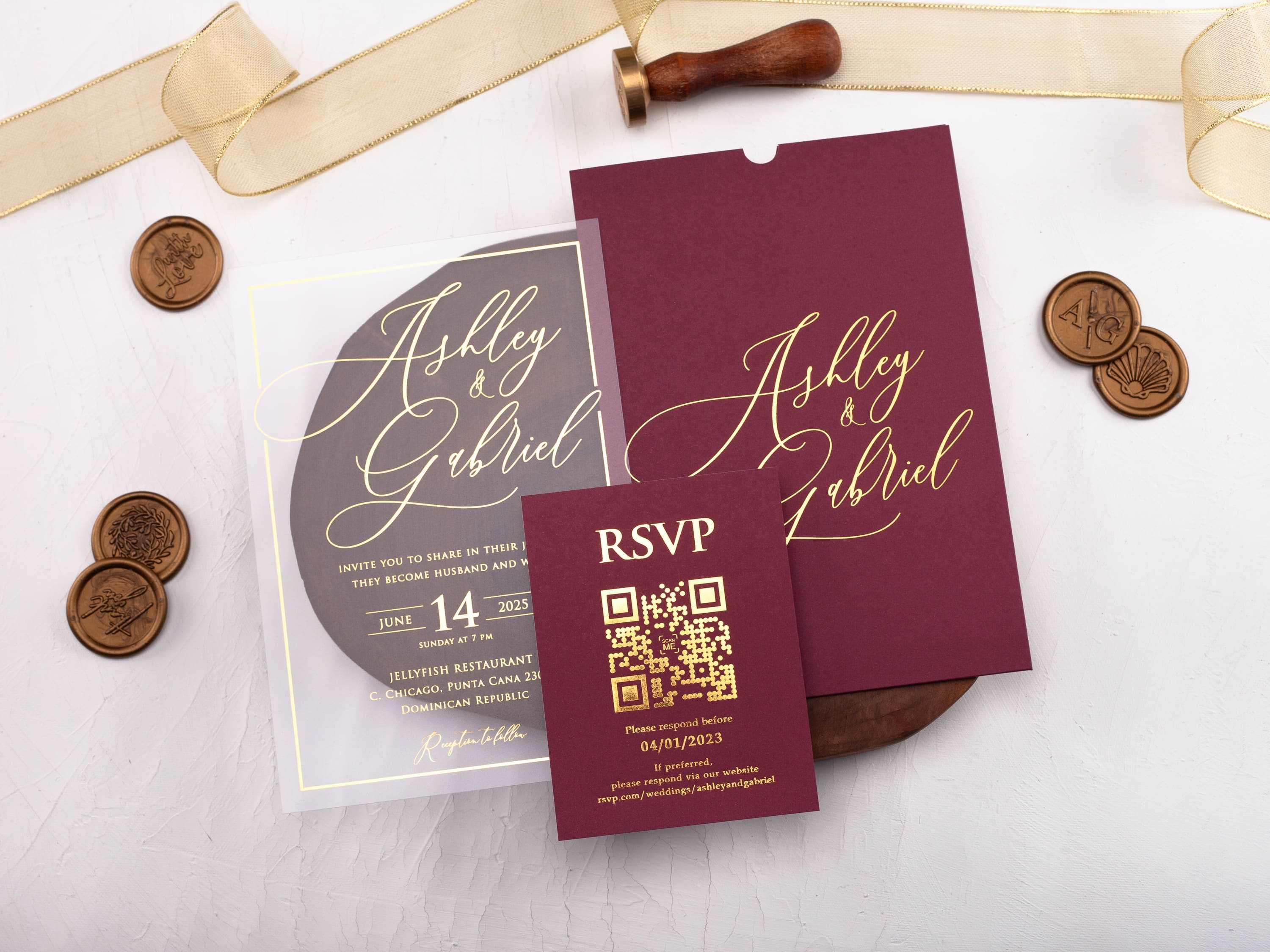
Acrylic introduces another variable because light can pass through or reflect from the card. A black jacket, pocket, or backing layer can improve contrast behind clear material. When the suite has several layers, review the fully assembled invitation rather than approving each piece in isolation.
Ask for a proof using the actual stock and print method whenever possible. Check it in daylight, warm indoor light, and low evening light. Tilt the card as a guest naturally would. If the time, location, or response deadline disappears at common viewing angles, strengthen the contrast or simplify the type before production.
How Can Black Invitations Feel Elegant Instead of Visually Heavy?
Let black establish the mood, then use restraint. Open spacing, a limited palette, and one focal detail can feel more luxurious than several borders, scripts, and metallic effects competing on the same card. A lighter insert or a clear acrylic layer can create balance without weakening the dramatic presentation.
Match the amount of decoration to the amount of wording. A short invitation can support a bold arch, crest, or floral frame. Longer wording benefits from a quieter layout and a simpler text area. Repeating one accent, such as gold names or a fine line, is enough to coordinate the suite.
Choose a design that suits the event rather than treating black as a theme by itself. Minimal typography can make it modern; embossed details and foil can make it formal; botanical artwork can soften it. Compare luxury wedding invitations for different ways to create depth while protecting readability.
What Are the Most Common Black Invitation Readability Questions?
What color lettering is most readable on a black wedding invitation?
White, ivory, gold, silver, and rose-gold lettering can all work well when the print is crisp and the contrast is strong. Choose a finish that remains clear under normal indoor lighting.
Is gold foil easy to read on black paper?
Gold foil can be highly readable on black stock because it creates strong visual separation. Readability still depends on letter size, spacing, and a clean foil impression.
Can script fonts be used on black invitations?
Yes, but use script selectively for names or short headings. Set dates, addresses, RSVP instructions, and longer details in a simpler typeface.
Should black wedding invitations use all capital letters?
All caps can work for short labels, but long lines become harder to scan. Use mixed case for detailed information and reserve capitals for small moments of emphasis.
Does matte or glossy black paper read better?
Matte black paper usually reduces glare, while glossy finishes can shift under direct light. Test your chosen print method on the actual stock before approving the full order.
How can black invitations avoid looking too dark?
Add visual breathing room, a restrained accent color, and a clear type hierarchy. A coordinated envelope or lighter insert can also balance the suite without weakening the dramatic look.
Compare contrast, typography, and finish across our black wedding invitations, then choose a design that feels dramatic and remains effortless to read.

Leave a comment
This site is protected by hCaptcha and the hCaptcha Privacy Policy and Terms of Service apply.