
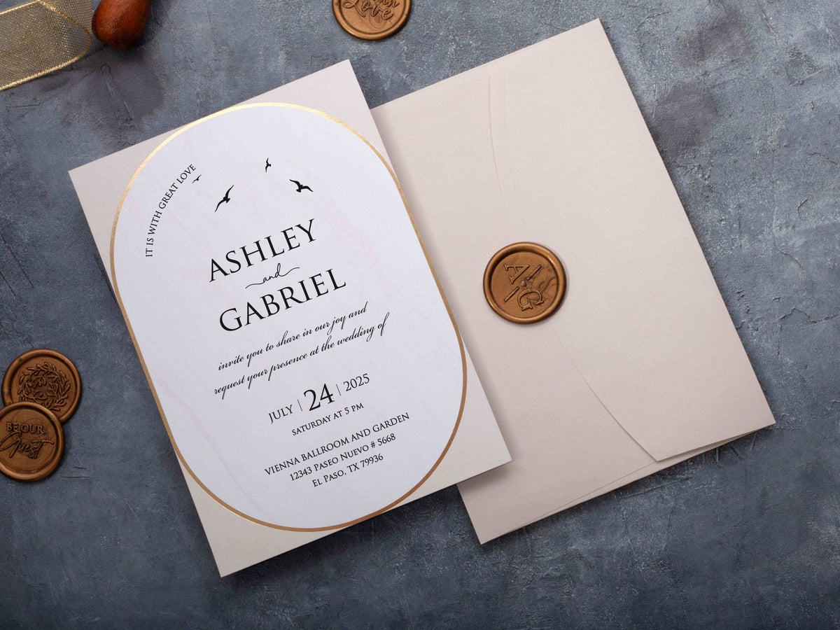
Modern wedding invitations feel current because every visual choice has a purpose. Clear hierarchy, confident type, open space, focused color, and one strong material or shape usually create more impact than several competing trends.
This guide shows how to combine colors, fonts, geometry, and metallic detail while keeping the invitation readable and connected to your celebration.
In short: Modern wedding invitations combine a clear layout with one or two intentional design choices, such as bold typography, an unexpected neutral palette, geometric shapes, or restrained metallic detail. Keep wording easy to scan and let spacing create sophistication. The strongest modern designs feel current without depending on a trend that dates quickly.
Which Colors Make a Wedding Invitation Feel Modern?
Modern palettes are usually focused rather than complicated. Black and ivory creates graphic contrast. Warm beige, sand, and stone feel calm and architectural. Muted green, dusty blue, terracotta, or deep burgundy can add personality without overwhelming the layout. Metallic detail works best as a small accent rather than a third or fourth dominant color.
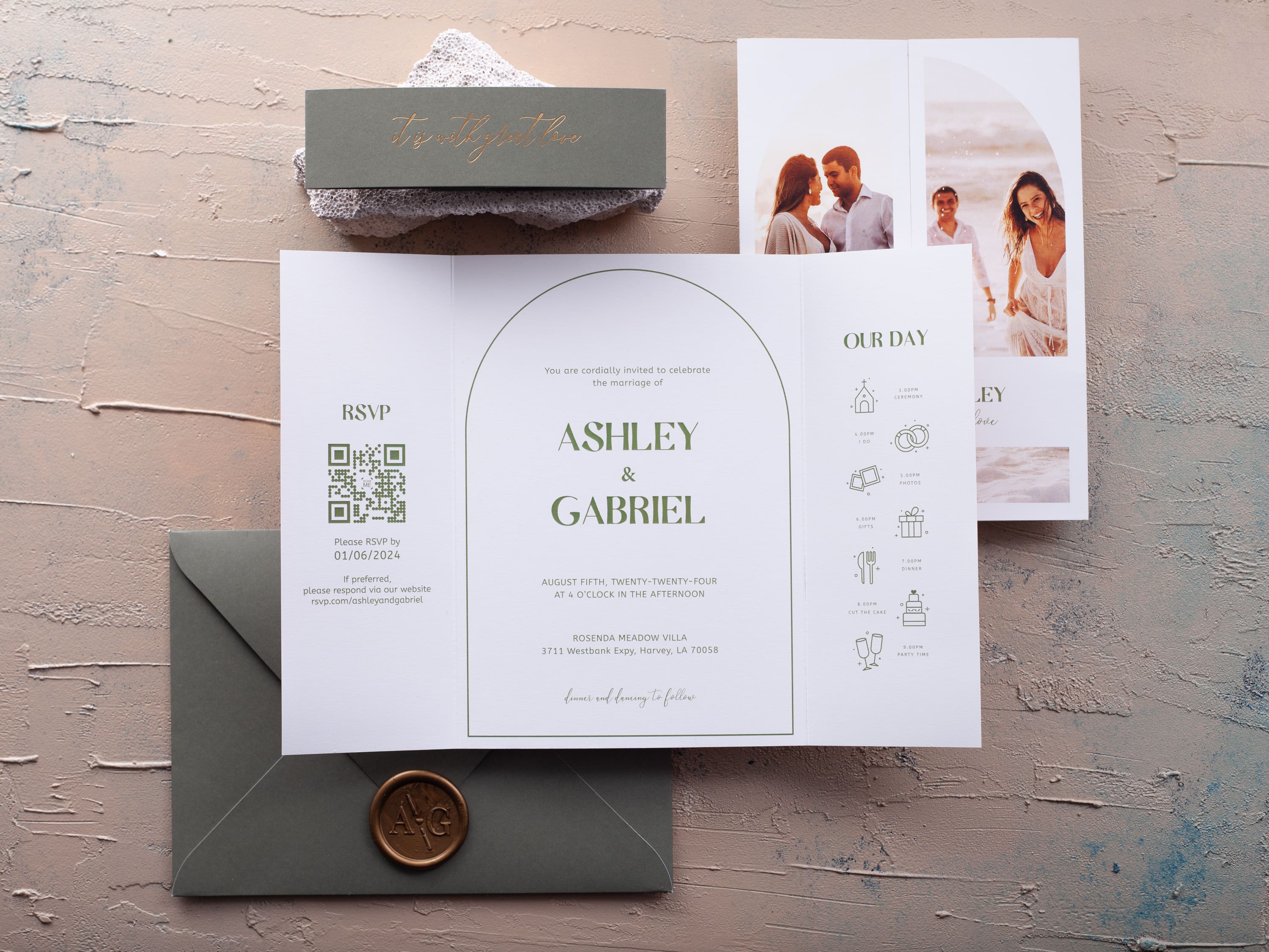
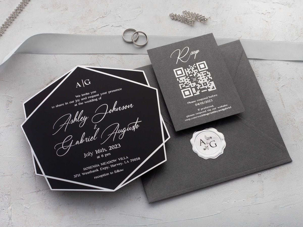
Choose colors from the venue, season, or materials already present in the wedding. A city celebration may suit black, white, and silver, while an outdoor event can use soft green with warm neutral paper. Test the palette for readability before refining the mood. Our modern wedding invitations show how restrained color can support clear type and shape.
Which Fonts Work Best for Contemporary Invitation Wording?
A clean sans-serif creates an immediate contemporary effect, especially when names use a bold weight or larger scale. A refined serif can also feel modern when the layout gives it enough space. Script is not prohibited, but it should be used selectively for a short name or accent rather than every line of practical information.
Limit the design to one or two type families. Create hierarchy with size, weight, and spacing instead of adding several decorative fonts. Venue, date, time, and response details should remain easy to scan. Print a proof at actual size because thin strokes and tight letter spacing can look elegant on screen but become difficult to read on paper, acrylic, or reflective foil.
How Can a Minimalist Layout Still Feel Wedding-Appropriate?
Minimal does not mean unfinished. Use proportion, alignment, paper quality, and one meaningful detail to create a sense of occasion. A monogram, carefully placed border, tactile stock, shaped edge, or short metallic accent can give the invitation ceremony without filling every open area.
Let spacing organize the content. Separate names, event details, and response information into clear groups. Keep decorative elements away from small wording and avoid centering every line simply because the card is formal. Compare clean single-panel formats in our flat wedding invitations when you want typography and material to carry the design.
Which Geometric Shapes and Formats Create a Modern Look?
Arch tops, half circles, asymmetric panels, and crisp rectangular layers can make a familiar invitation feel contemporary. Geometry is most effective when it supports the layout: a curve can frame names, a strong edge can align text, and layered panels can separate information. Adding several unrelated shapes usually makes the design busier rather than more modern.
Consider how the shape fits the envelope, jacket, and inserts. Unusual silhouettes may require more careful assembly or mailing. Use one dominant geometry and repeat it subtly through a border, monogram, or insert. Explore our geometric wedding invitations to compare structured patterns and shaped formats.

How Should Metallic Foil Be Used in a Modern Design?
Use metallic foil to emphasize one part of the hierarchy: names, a date, a monogram, or a narrow border. Gold adds warmth, silver feels cooler, and rose gold softens blush or neutral palettes. A restrained application creates contrast without turning every line into a reflective surface.
Pair foil with generous space and readable type. Small, delicate text can lose clarity as it catches light, especially on dark or transparent materials. Review a physical proof in different lighting and check that the metallic detail aligns cleanly with printed elements. If the invitation already uses an unusual shape or bold color, foil should support that idea rather than compete with it.

How Do You Choose a Modern Style That Will Age Well?
Build the design around typography, spacing, and a limited palette before adding trend-led details. These fundamentals remain attractive because they make information clear. Choose one distinctive feature that has personal meaning, such as a venue-inspired shape, a shared color, or a monogram, instead of combining every popular finish.
Look at the invitation as part of the complete celebration. It should feel at home with the venue and level of formality without copying every decorative element. Review the proof without mood-board context: if the wording is easy to understand and the composition still feels balanced, the design is more likely to age well. Browse all wedding invitations to compare modern choices with classic, floral, folded, and destination formats.
Explore our modern wedding invitations to compare clean typography, refined color, geometric shapes, and contemporary materials.
Frequently Asked Questions
What makes a wedding invitation look modern?
Clean spacing, confident typography, a focused palette, and one clear visual idea usually create a modern look. The design should feel intentional rather than crowded.
Which colors are popular for modern wedding invitations?
Warm neutrals, black and ivory, muted green, dusty blue, terracotta, and restrained metallics all work well when they connect to the celebration.
Can script fonts be used in a modern invitation?
Yes, when script is used sparingly. Pair a short script accent with a clean serif or sans-serif typeface for the detailed wording.
Are geometric invitations suitable for formal weddings?
Yes. Precise shapes, balanced spacing, and premium finishes can make a geometric design feel highly formal and refined.
How can minimalist invitations avoid feeling plain?
Use proportion, paper quality, typography, and one tactile or metallic detail to create interest without adding clutter.
Will a modern invitation style look dated later?
It is less likely to date when the design relies on strong typography, balanced spacing, and a limited palette instead of several short-lived trends.

Leave a comment
This site is protected by hCaptcha and the hCaptcha Privacy Policy and Terms of Service apply.