
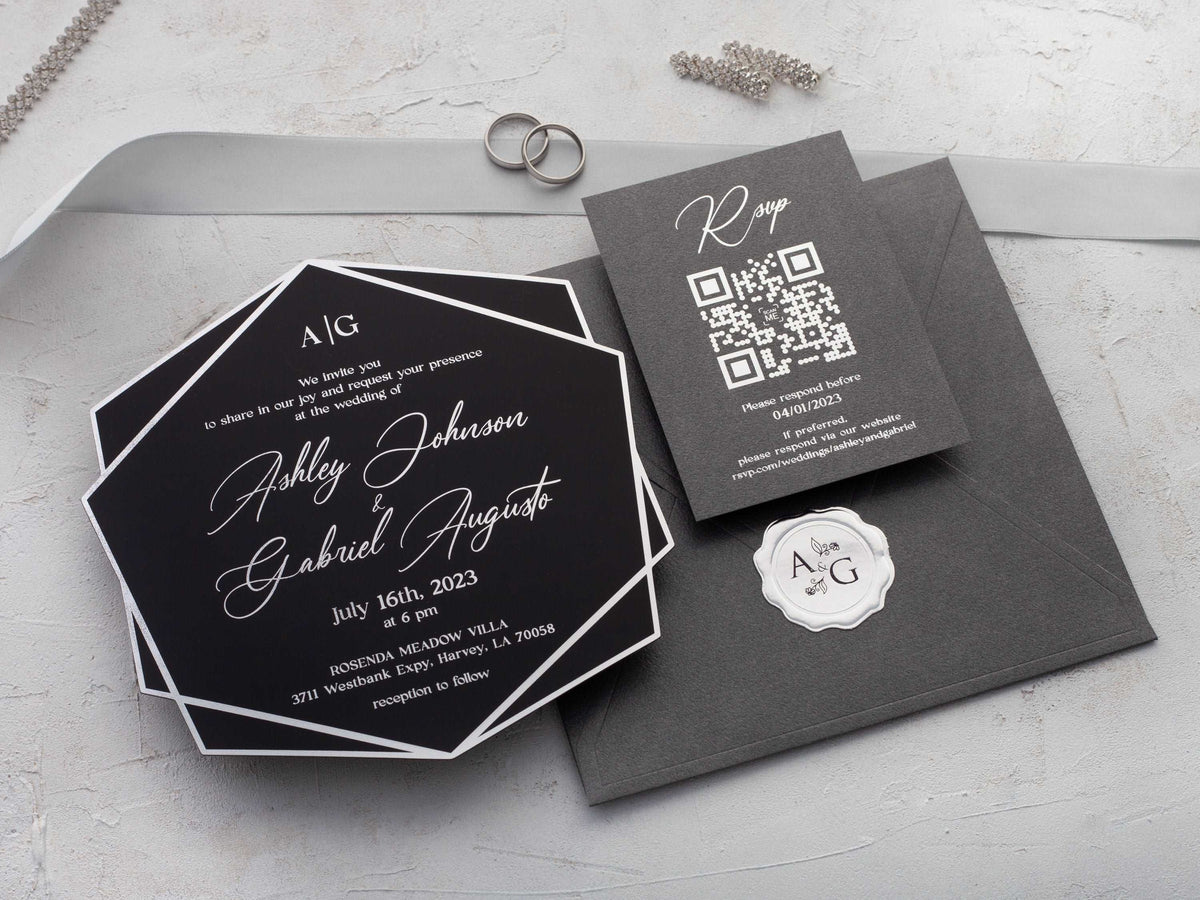
Geometric wedding invitations can feel crisp, expressive, and timeless at once. The key is not to fill every corner with pattern. It is to choose a clear visual idea, give your wording enough room, and repeat details with purpose. This guide will help you compare shapes, materials, colors, and suite layouts before you personalize a design.
In short: geometric wedding invitations use clean lines, repeating shapes, arches, borders, or angular layouts to create a modern look. Choose one strong geometric element, keep the wording area uncluttered, and match the pattern scale to your invitation format so the design feels intentional rather than busy.
What makes a wedding invitation look geometric?
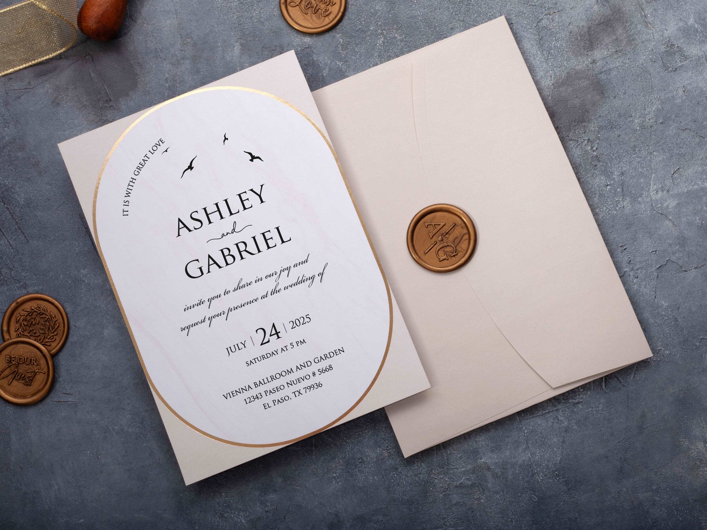
A geometric invitation uses shape and line as part of its visual structure. You might see an arch framing the couple's names, a fine border dividing the wording into sections, or overlapping angles that guide the eye across the card. The design does not need to be bold or abstract. Even a slim rectangular frame or a repeated circle can create a modern geometric character.
Start by deciding which element should carry the style. If the border is detailed, keep the typography and background simple. If the invitation uses a dramatic arch or diagonal panel, let that shape lead and avoid adding several competing motifs. The strongest geometric wedding invitations use repetition to create order: one line weight, one family of shapes, and a consistent amount of space around the wording. This balance makes the design memorable while keeping the ceremony details easy to find.
Which geometric shapes suit modern wedding styles?
Arches and circles soften a modern design and work well for romantic, garden, or contemporary ballroom weddings. Hexagons and angular frames feel more architectural, making them a natural choice for city venues, galleries, and minimalist celebrations. Straight borders and intersecting lines create a quieter effect that can suit almost any setting.
Think about the shapes already present in your venue and decor. Curved doorways may inspire an arched layout, while tiled floors or modern windows may suggest a grid or angular frame. You do not need to copy the venue literally. A small visual echo is enough to make the stationery feel connected to the event. If you want a current look without a strong pattern, compare the clean typography and restrained structures in our modern wedding invitations. Choose a shape that supports your wedding style, then keep it consistent rather than mixing unrelated forms.
How can you keep geometric invitations easy to read?
Readability starts with a clear hierarchy. Your names and the type of celebration should be the easiest elements to notice, followed by the date, time, venue, and response instructions. A geometric border should frame that information, not cross through it. Leave open space around small text and avoid placing essential wording over dense patterns.
Use no more than two type styles: one expressive font for names or a short heading, and one clean font for practical details. Keep line length comfortable, especially on narrow panels or arched cards. Strong contrast matters too. Dark lettering on a light surface is reliable, while metallic details work best at a readable size and with enough separation from the background. Before ordering, review a proof at actual size. Check every numeral, address line, and website or QR instruction. A design can look beautiful on a large screen yet feel crowded when printed, so real-size proofing is an important final test.
Which colors and finishes work with geometric patterns?
Two or three coordinated colors are usually enough. Black, ivory, and gold create a formal architectural look. Blush, white, and rose gold soften angular patterns. Emerald, navy, or burgundy can make a geometric frame feel rich and dramatic when the wording remains high contrast. If the pattern is detailed, use color sparingly so the eye still knows where to begin.
Foil works especially well for one focal element, such as a border, monogram, arch, or the couple's names. Repeating foil across every line can flatten the hierarchy and reduce readability. Printed linework offers a quieter finish and may be better when you want several small shapes. You can also combine a simple metallic frame with matte text. Keep the finish consistent across the invitation, response card, and detail card so the suite feels intentional rather than assembled from separate ideas.

Do geometric designs work better on acrylic or paper?
Both materials can work beautifully, but they create different effects. Clear acrylic wedding invitations emphasize crisp linework, floating borders, and metallic printing. They are a strong match for minimal layouts because the transparent surface already adds visual interest. Protect the wording area with enough contrast, and avoid placing small text over a busy envelope liner or background that may show through.
Paper offers more texture, color depth, and printing choices. A smooth card keeps thin lines precise, while a lightly textured stock can make a simple border feel softer and more tactile. Paper is also useful for folded formats or suites with several coordinated inserts. Let your priorities guide the choice: acrylic suits a sleek statement piece, while paper gives you greater flexibility for texture, panels, and layered information. Whichever material you prefer, review how the pattern, text, and background interact as one finished piece.

How should you coordinate the rest of the invitation suite?
Coordination comes from repetition, not duplication. Choose one element from the main invitation and carry it across the suite. That may be a fine arch on the response card, a single diagonal line on the details card, or the same foil border on the envelope flap. Supporting cards can be simpler than the invitation while still feeling connected.
Keep wording order consistent as well. Use the same type hierarchy, spacing, and alignment on every piece so guests can scan the suite naturally. If the main invitation has a strong pattern, allow the insert cards to provide visual rest. A matching envelope color or liner can add depth without introducing another motif. Before approving the full set, place every piece together and check that one design remains the clear focal point. You can also browse the wider wedding invitation collection to compare how different formats handle coordinated details, inserts, and finishes.
What should you know before ordering geometric invitations?
Are geometric wedding invitations suitable for formal weddings?
Yes. Fine lines, restrained symmetry, metallic foil, and a limited color palette can make geometric invitations feel polished and formal.
Which shapes are most popular for geometric invitations?
Arches, circles, hexagons, angular frames, intersecting lines, and repeating border patterns are common choices.
Can geometric invitations include floral details?
Yes. A small floral accent can soften strong lines without changing the modern geometric character.
Is acrylic a good material for geometric designs?
Yes. Acrylic highlights crisp linework and metallic printing, especially when the wording area remains clear.
How many colors should a geometric invitation use?
Two or three coordinated colors usually create enough contrast without making the layout feel crowded.
Should every card in the suite use the same pattern?
Not necessarily. Repeat one shape, border, or foil detail across the suite to create cohesion without duplicating the full pattern.
Ready to find a modern pattern that feels balanced and personal? Explore our geometric wedding invitations and customize your favorite design.


Leave a comment
This site is protected by hCaptcha and the hCaptcha Privacy Policy and Terms of Service apply.