
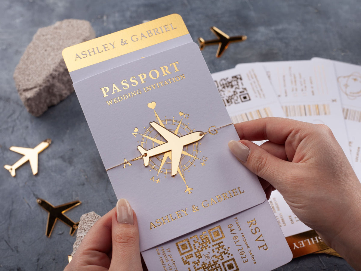
Foil wedding invitations can make a first impression before guests read a single line. Gold, silver, and rose gold each reflect light differently, and that finish can shift the mood of the same color palette from classic to modern or softly romantic.
This guide will help you compare foil colors, invitation materials, wording contrast, and practical value so you can choose a finish that supports your wedding style and remains easy to read.
In short: Gold foil feels warm and classic, silver foil looks crisp and modern, and rose gold foil adds a soft romantic glow. The best choice depends on your palette, invitation material, wording contrast, and venue style. Compare each finish in the same lighting before approving your final design.
What are foil wedding invitations?
Foil wedding invitations use a thin metallic layer to create reflective details on the card. The foil may highlight your names, a monogram, border, illustration, or selected wording. Because it reflects light rather than behaving like an ordinary printed color, it gives the invitation a distinct shine and can make a restrained layout feel more dimensional.
Foil is different from metallic ink. Metallic ink contains reflective particles and usually creates a softer shimmer, while foil tends to look brighter and more mirror-like. The exact effect also depends on the surface, foil color, line weight, and production method. Fine foil details can feel delicate; broader lettering or borders create a stronger statement.
The best designs use foil with a clear purpose. Instead of applying it to every line, choose the elements you want guests to notice first. You can compare finishes, formats, and color combinations in our foil printed wedding invitations. Look at each design as a complete suite, including the envelope and inserts, because those surrounding colors influence how the metallic finish appears.
Which foil color works best with your wedding palette?
Start with the temperature of your palette. Gold foil naturally supports warm colors such as ivory, cream, blush, burgundy, terracotta, brown, and emerald. Silver foil feels cooler and pairs easily with white, gray, black, navy, icy blue, and cool greenery. Rose gold sits between pink and copper, making it a natural partner for blush, mauve, dusty rose, warm gray, and soft neutrals.
Contrast matters as much as harmony. A metallic finish should remain visible without fighting the background. Gold can glow against navy or black and feel quieter on beige or ivory. Silver creates a crisp highlight on dark colors but may appear subtle on pale gray. Rose gold can soften a deep green or burgundy card, yet it may blend into pink paper if the tones are too close.
Use your venue and season as helpful filters, not strict rules. A candlelit ballroom may support warm gold, while a glass-and-steel city venue may suit silver. For a destination celebration, navy and gold can connect the travel theme with a polished finish. Review the card, envelope, and any jacket together so the palette reads as one coordinated choice.

How do gold, silver, and rose gold change the mood?
Gold foil often feels warm, celebratory, and established. It can support a traditional black-tie suite, but it is not limited to formal weddings. Paired with clean typography, natural paper, or a simple passport format, gold can also feel relaxed and contemporary. The surrounding design determines whether the result looks ornate or understated.
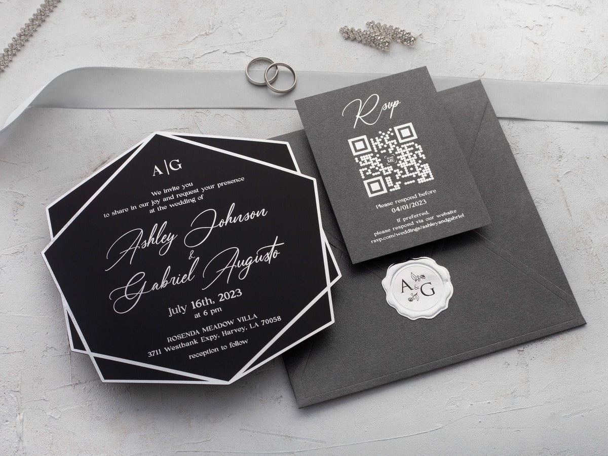
Silver foil brings a cooler, sharper quality. It works well with minimal layouts, winter palettes, monochrome stationery, and modern venues. Silver can also balance a warm color by adding a clean point of contrast. If you want the wording to feel crisp rather than romantic, silver is often the most direct choice.
Rose gold foil adds warmth with a softer pink cast. It suits romantic palettes, modern florals, and designs that need a gentler metallic accent than yellow gold. Rose gold is not identical to copper: copper usually appears deeper and more orange, while rose gold reads lighter and pinker. Compare physical samples when tone matters, because screen colors cannot fully reproduce reflectivity. Whichever finish you choose, repeat it selectively across one or two suite elements so the invitation feels coordinated without becoming visually heavy.
Which invitation materials work best with foil?
Smooth paper is a versatile choice because it supports crisp edges and a wide range of background colors. Light paper lets the foil act as a refined accent, while dark paper creates more dramatic contrast. Textured stock can add tactile character, but very fine lines may need more weight to remain clean. Always evaluate the actual production proof rather than assuming the screen preview will match the finished surface.
Acrylic creates a different effect: metallic lettering can appear to float over clear, frosted, or colored material. Strong contrast is essential because the envelope, jacket, or surface behind a clear card may show through. If you like that polished look, compare how foil and transparency work together in our rose gold foil acrylic wedding invitations.
The invitation format also affects the finish. Passport, gatefold, trifold, and layered designs offer several surfaces, so one metallic focal point is often enough. A flat card may use foil for a border or names, while a folded suite can reserve it for the cover and keep the inside details matte. Our gold foil printed wedding invitations show how the same warm finish works across paper, acrylic, passport, and folded styles.
How can you keep foil invitation wording readable?
Begin with hierarchy. Your names, wedding date, and venue should be easy to find, followed by time and response details. Foil can emphasize the first level, but long blocks of reflective text are harder to scan as the card moves. Use foil for names, a short heading, a border, or selected details, and keep practical wording in a clear printed type when needed.
Choose fonts with enough stroke weight and spacing. A delicate script can work for two names, yet it may lose clarity in a full address or small line of instructions. Pair one expressive font with a clean serif or sans-serif for the information guests must act on. Leave open space around metallic wording so reflections do not visually merge with nearby decoration.
Background contrast is equally important. Gold stands out strongly on black, navy, burgundy, or emerald, while dark printed wording can support gold accents on ivory or blush. Check the proof in daylight and indoor light, then view it at arm's length as well as close up. Every date, numeral, website, and response instruction should remain clear before the finish is approved.

Are foil wedding invitations worth the investment?
Foil can be worthwhile when the reflective finish supports the experience you want to create. It gives names, borders, and monograms a tactile focal point that ordinary printed color does not fully reproduce. That effect can make a simple layout feel special without requiring dense artwork or several decorative layers.
Value depends on where you use it. Applying foil to one key piece can create more impact than adding it to every enclosure. You might foil the main invitation and keep the details card matte, or repeat a small metallic monogram on the envelope. This approach maintains cohesion while controlling visual weight and production choices.
Consider the complete order before deciding. Material, shape, number of inserts, envelope, jacket, quantity, and mailing weight all contribute to the final cost and experience. If foil matters most, simplify another element rather than compromising readability. If guests mainly need extensive travel or schedule information, prioritize a format that organizes those details first. The best investment is a suite that communicates clearly and feels consistent with your event, not the one with the greatest number of finishes.
How should you choose your final foil finish?
Narrow the decision to two finishes that work with your palette, then compare them on the intended material. Review samples in daylight, warm indoor light, and the type of evening light expected at your venue. Metallic surfaces change with angle, so a finish that looks subtle in one setting may appear much brighter in another.
Next, test the actual wording and size. Check names, dates, thin strokes, punctuation, and small practical details. Confirm that the foil aligns cleanly and that decorative elements do not crowd the text. Place the invitation beside its envelope, jacket, and inserts to make sure one finish leads the suite rather than competing with several unrelated accents.
Finally, choose the effect that fits your priorities. Pick gold for adaptable warmth, silver for a cooler modern edge, or rose gold for a soft romantic glow. Your invitation does not need to match every metallic detail at the wedding; it only needs to belong to the same visual story. When you are ready to compare complete designs, explore our wider wedding invitations and focus on the combination of color, material, format, and finish that feels most like your celebration.
What should you know before ordering foil wedding invitations?
What is the difference between foil printing and metallic ink?
Foil printing applies a reflective metallic layer, while metallic ink creates a softer shimmer. Foil usually produces stronger shine and sharper contrast.
Is gold foil too formal for a relaxed wedding?
No. Gold foil can feel relaxed when paired with simple typography, natural colors, or an understated invitation shape.
Does silver foil work with warm colors?
Yes. Silver can balance warm colors with a clean contrast, especially when the design also includes white, gray, navy, or cool greenery.
Is rose gold foil the same as copper foil?
Not exactly. Rose gold is usually softer and pinker, while copper tends to look deeper, warmer, and more orange.
Can foil be used on acrylic wedding invitations?
Yes. Foil lettering can create a polished contrast on clear, frosted, or colored acrylic when the text weight and background are chosen carefully.
Should every card in the invitation suite use foil?
Not necessarily. Repeating foil on one or two key pieces can create cohesion while keeping the suite balanced and the wording easy to read.
Ready to compare finishes? Explore our foil printed wedding invitations and choose a design that matches your palette, venue, and level of formality.

Leave a comment
This site is protected by hCaptcha and the hCaptcha Privacy Policy and Terms of Service apply.