
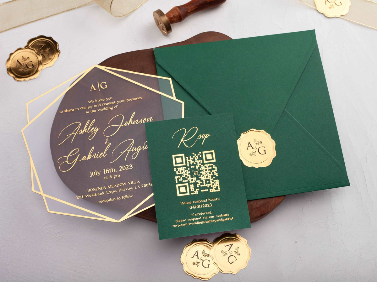
Emerald green wedding invitations create an immediate sense of depth. The color can feel botanical, glamorous, modern, or formal depending on the material and the colors around it. Because emerald is visually strong, a focused palette and clear hierarchy make the finished suite feel richer rather than heavier.
Use this guide to decide where emerald belongs, which metallic finish supports it, and how to keep every practical detail easy to read.
In short: emerald green wedding invitations feel rich, elegant, and versatile when paired with warm gold, soft ivory, or clear acrylic. Use emerald as the main color or a framing accent, protect contrast around small wording, and repeat one finish across the suite for a coordinated result.
What colors pair best with emerald green wedding invitations?
Ivory and warm white soften emerald without weakening its character. Gold adds warmth and ceremony, while black creates a sharper evening look. Blush and dusty rose introduce a romantic contrast, and champagne keeps the palette quiet. If the wedding includes natural wood, stone, or greenery, emerald can connect those surroundings to the stationery without reproducing every venue color.
Limit the suite to one main neutral, emerald, and one metallic or accent color. Too many competing tones can make the invitation feel busy and reduce the emphasis on names and date. Browse our emerald green wedding invitations to compare full-color backgrounds, jackets, borders, and acrylic layers.
Should you choose gold foil or silver details with emerald?
Gold is the classic companion because its warmth balances emerald's cool depth. It works especially well for formal wording, borders, monograms, and small botanical details. Silver creates a cooler, cleaner impression and can suit winter celebrations, modern venues, or a palette that already includes gray and crystal. Rose gold is softer and works best when blush or warm florals appear elsewhere.
Whichever metal you choose, use it deliberately. Foil catches light, so small lines and tightly spaced script may become harder to read at some angles. Reserve the reflective finish for names, a date, a monogram, or a border, then use opaque ink for supporting information. Our gold foil wedding invitations show how metallic detail can create hierarchy without covering every line.

Does emerald green work better on acrylic or paper?
Paper gives emerald a soft, saturated surface and supports letterpress, embossing, and traditional foil. A dark green card can feel substantial and formal, while an ivory card with emerald printing feels lighter. Paper also offers a broad range of textures, but very rough stock may reduce the crispness of fine type.
Acrylic creates a cleaner, more architectural effect. Emerald can appear as a translucent color, an opaque printed area, or a separate jacket behind a clear panel. Because transparency changes contrast, review the invitation against the envelope or backing it will actually use. Small wording should remain opaque and readable. Compare material and layering choices in our acrylic wedding invitations.
How can floral details soften an emerald invitation?
Choose florals that create breathing room instead of covering the card. Fine ivory linework, white blossoms, or a restrained botanical corner can soften a full emerald background. On clear acrylic, a green-and-gold floral border can frame the wording while preserving open space. Match the illustration style to the typography so the suite feels intentionally composed.
Repeat only one or two floral elements across the invitation, insert, and envelope liner. Exact duplication is not necessary; a small leaf from the main artwork can become a subtle motif. Keep flowers away from small venue and response details, and proof fine metallic lines at actual size. Florals should support the message, not become a patterned obstacle behind it.

Which wedding styles suit emerald green invitations?
Emerald adapts well because the supporting choices define the mood. Gold foil, serif type, and a monogram create a formal ballroom look. Clear acrylic and clean sans-serif wording feel contemporary. Botanical linework and ivory paper suit a garden celebration, while velvet ribbon, dark envelopes, and deep florals create an evening or winter atmosphere.
Let the venue and level of formality guide the amount of color. A bright daytime ceremony may need emerald only as a border or envelope. A candlelit reception can support a full dark background. Review the suite alongside the wedding's materials rather than matching every decorative element. Compare the wider range of wedding invitations when deciding how strongly emerald should lead the design.
How should you coordinate envelopes and insert cards?
Use the envelope to either continue the emerald statement or provide contrast. A matching green envelope feels immersive; ivory or champagne lets a dark invitation stand out when opened. Black is dramatic but requires a readable addressing method. A patterned liner can add detail, provided it does not compete with the invitation itself.
Keep inserts in the same typographic system and repeat one color or metallic accent. Not every card needs a full emerald background. Alternating ivory and green pieces can make the suite easier to navigate while staying coordinated. Confirm that all wording remains legible, then assemble a complete sample to check thickness, enclosure order, and the first impression guests receive.
Ready to build a rich, coordinated suite? Explore our emerald green wedding invitations and personalize the details.
Frequently Asked Questions
Is emerald green suitable for every season?
Yes. Pair it with fresh ivory in spring, warm gold in fall, or deeper neutrals in winter.
Does gold foil make emerald invitations harder to read?
Not when the foil is used at a practical size and the wording has enough open space and contrast.
Can emerald green invitations feel modern?
Yes. Clean typography, clear acrylic, and restrained linework give emerald a modern rather than traditional look.
Which envelope colors work with emerald green?
Ivory, black, blush, champagne, and matching emerald envelopes can all work when the liner and printing remain coordinated.
Should emerald green be the background or an accent?
Either works. A full emerald background feels dramatic, while emerald borders or jackets provide a lighter effect.
Can emerald green pair with rose gold?
Yes, although yellow gold usually creates stronger classic contrast and rose gold produces a softer, warmer result.


Leave a comment
This site is protected by hCaptcha and the hCaptcha Privacy Policy and Terms of Service apply.