

White and gold wedding invitations are timeless because they combine visual calm with a focused metallic accent. The palette can feel minimal, romantic, or highly formal, but the result depends on more than color. Material, contrast, type size, and the placement of gold all affect how elegant and readable the suite becomes.
This guide compares paper and acrylic, explains the main gold finishes, and helps you decide when jackets or seals genuinely improve the design.
In short: white and gold wedding invitations look most elegant when the material, gold finish, and text contrast are planned together. Choose opaque white printing for clear acrylic, use gold foil as a focused accent, and add a jacket or wax seal only when it improves hierarchy instead of crowding the suite.
Why are white and gold invitations considered timeless?
White creates space and clarity, while gold signals ceremony without demanding another strong color. The pairing works across seasons and venues because its mood comes from typography and material. A clean sans-serif on translucent acrylic feels modern; a refined serif on cotton paper feels classic; delicate floral linework can soften either direction.
The palette also coordinates easily with ivory, black, blush, champagne, and natural greenery. Keep the core combination visible instead of adding several accent colors. Our white and gold wedding invitations collection shows how jackets, borders, transparent panels, and different gold tones change the same basic palette.
Should you choose acrylic or paper for a white and gold design?
Paper provides a soft, familiar surface and supports foil stamping, embossing, letterpress, and textured stock. It is a practical choice when the invitation includes substantial wording or when you want the tactile quality of cotton or smooth cardstock. White paper naturally supplies a high-contrast base, so gold can be reserved for the most important details.
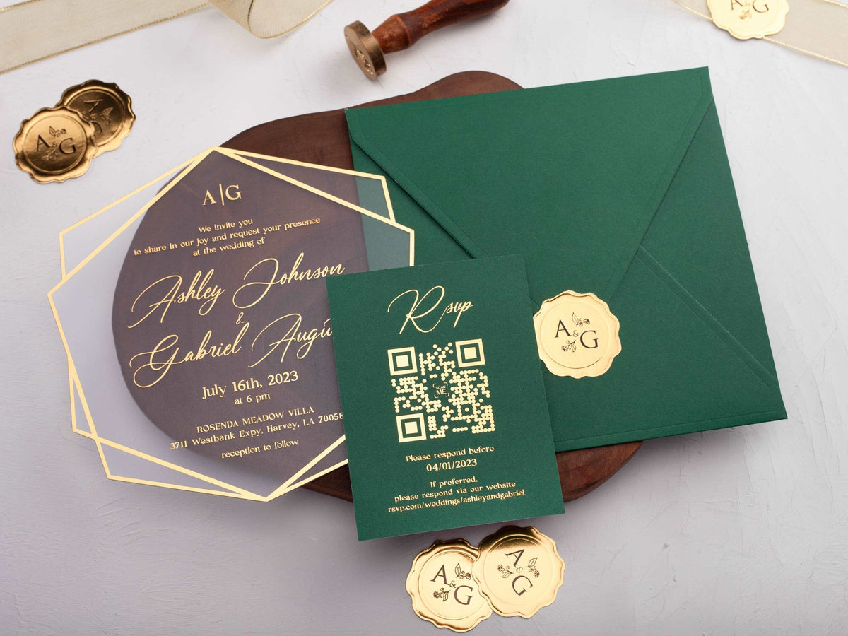
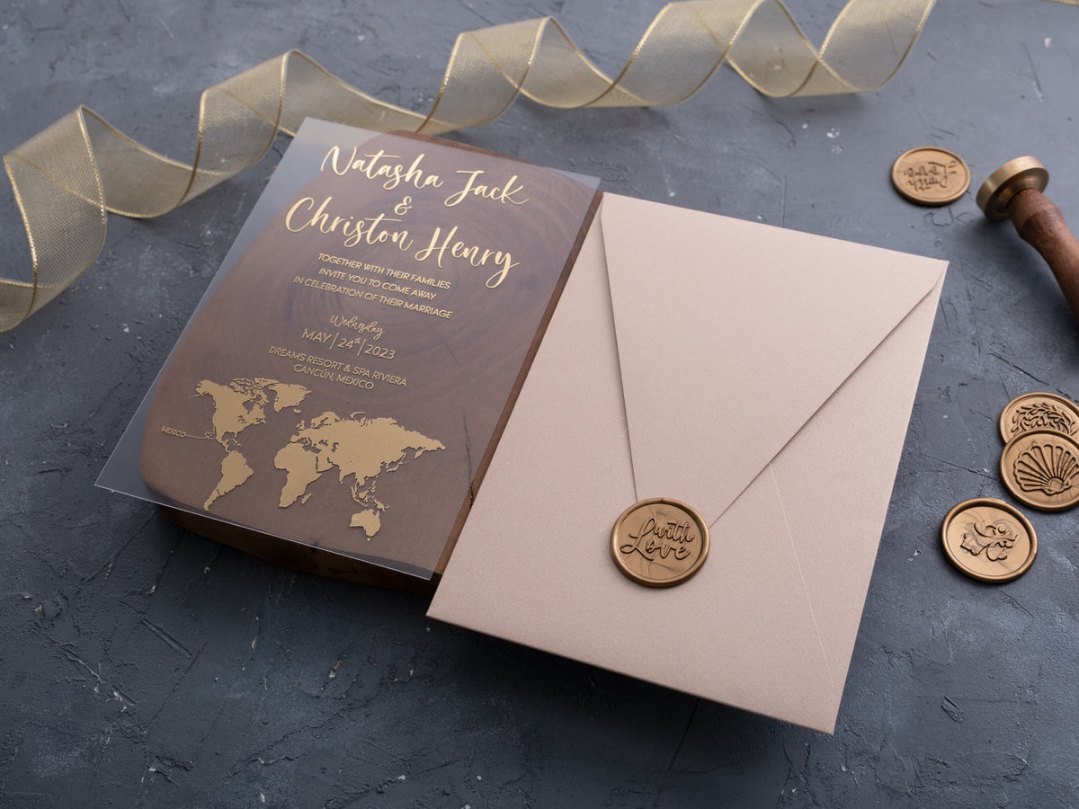
Acrylic creates depth and a more contemporary presentation. Clear acrylic needs careful contrast: opaque white printing can carry small wording, while gold can highlight names or a border. Frosted or white acrylic provides a quieter background. Compare our white and gold acrylic wedding invitations with paper wedding invitations before choosing the material.

How can you keep gold lettering easy to read?
Reflective lettering changes with the light, so do not judge it only from a flat digital proof. Use gold for larger names, dates, monograms, or short headings. Keep venue, time, address, and response information in an opaque ink when those lines would otherwise be small or delicate. Open spacing around metallic type helps each character remain distinct.
Background contrast matters too. Gold on white is elegant but subtle; it may need heavier letterforms or a darker supporting color. On clear acrylic, the envelope, jacket, or table beneath the invitation can alter readability. Review a physical proof in daylight and indoor light, then check it against the complete backing and enclosure rather than holding it in the air.
Which gold finish works best with white invitations?
Yellow gold has the strongest warmth and creates a traditional formal statement. Champagne gold is softer and blends easily with ivory, blush, and neutral palettes. Rose gold introduces a pink undertone, while antique gold feels deeper and can suit vintage or ornate designs. The right finish should relate to the celebration's other metals without requiring a perfect match.
Foil creates the clearest reflection and a crisp premium detail. Metallic ink is less mirror-like and can be easier for larger areas or fine illustration. Digital gold tones provide color rather than a true reflective surface. Compare examples in our gold foil wedding invitations and decide whether the metal should be the focus or a restrained accent.
Do folded jackets and wax seals improve the design?
A folded jacket can frame a clear or white invitation, add privacy, and create space for contrasting material. It is especially useful when the main card is minimal and the suite needs a stronger opening experience. A wax seal can secure a jacket or belly band and repeat a monogram, but it should not cover essential wording or become the only element holding several pieces together.
Add these components only when they have a practical or compositional purpose. Extra layers increase thickness, assembly time, and mailing weight. A seal on an inner jacket is usually better protected than one placed directly on the outer envelope. Build one complete sample, open it in the intended order, and confirm that the enclosure feels deliberate rather than overfilled.

How should you coordinate the full invitation suite?
Use the same typographic hierarchy across the invitation, RSVP information, details card, and website reference. Repeat one gold finish and one white or ivory tone rather than mixing several metallic and paper colors. The pieces do not need identical layouts, but guests should recognize them as part of one system.
Decide which card carries the strongest visual moment. If the invitation uses a gold border and monogram, the inserts can remain mostly white with a small metallic heading. If the jacket or seal is decorative, keep the interior wording restrained. Finally, assemble the suite in reading order, test the envelope fit, and confirm that names, date, time, venue, and response instructions are immediately clear.
Ready to compare clean white details with warm metallic finishes? Explore our white and gold wedding invitations.
Frequently Asked Questions
Are white and gold wedding invitations formal?
They can be. Refined typography, balanced spacing, and restrained foil create a formal look without requiring heavy decoration.
Can gold text be printed on clear acrylic?
Yes. Gold foil or metallic printing works well, but small wording may need an opaque backing or stronger contrast.
Is yellow gold or champagne gold more versatile?
Champagne gold is softer, while yellow gold creates stronger warmth and a more traditional metallic statement.
Do white invitations need a colored envelope?
No. A white or ivory envelope can feel cohesive; a darker liner can add contrast without changing the invitation itself.
Should every detail use gold foil?
No. Reserve foil for names, borders, or a monogram so the hierarchy remains clear and the design stays readable.
Can a wax seal be mailed safely?
A wax seal can work, but an outer envelope helps protect it and postal handling requirements should be checked before mailing.

Leave a comment
This site is protected by hCaptcha and the hCaptcha Privacy Policy and Terms of Service apply.