
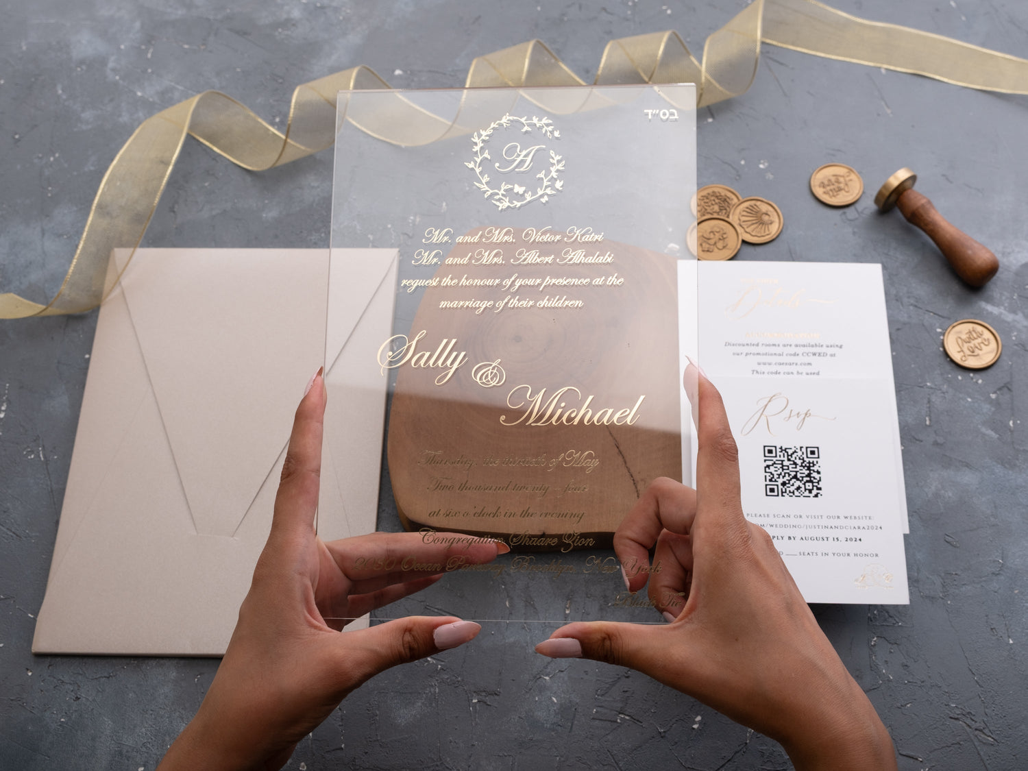
In short: Clear acrylic wedding invitations create a clean, modern look, while foil acrylic designs add reflective detail and a more formal finish. Choose clear acrylic when simplicity and transparency suit your event; choose foil when you want names, borders, or artwork to stand out with a polished, celebratory feel.
Acrylic invitations make a strong first impression because the material changes how every design element appears. Transparency can make typography seem to float, while metallic foil catches the light as the card moves. Both choices can feel modern and luxurious, but they create different levels of contrast, formality, and visual detail.
The best option is not simply the one that looks most dramatic in a photograph. You also need to consider the invitation wording, the colors behind the card, the finished suite, and the way it will travel through the mail. This guide compares clear and foil acrylic invitations so you can choose a design that remains beautiful and practical from proof to delivery.
What Is the Difference Between Clear and Foil Acrylic Invitations?
Clear acrylic describes the transparent card material. The design may use ink, UV printing, white printing, or a combination of techniques, but the open background remains part of the look. The result feels light, architectural, and contemporary. Browse clear acrylic wedding invitations to see how typography, florals, and monograms interact with the surface beneath the card.
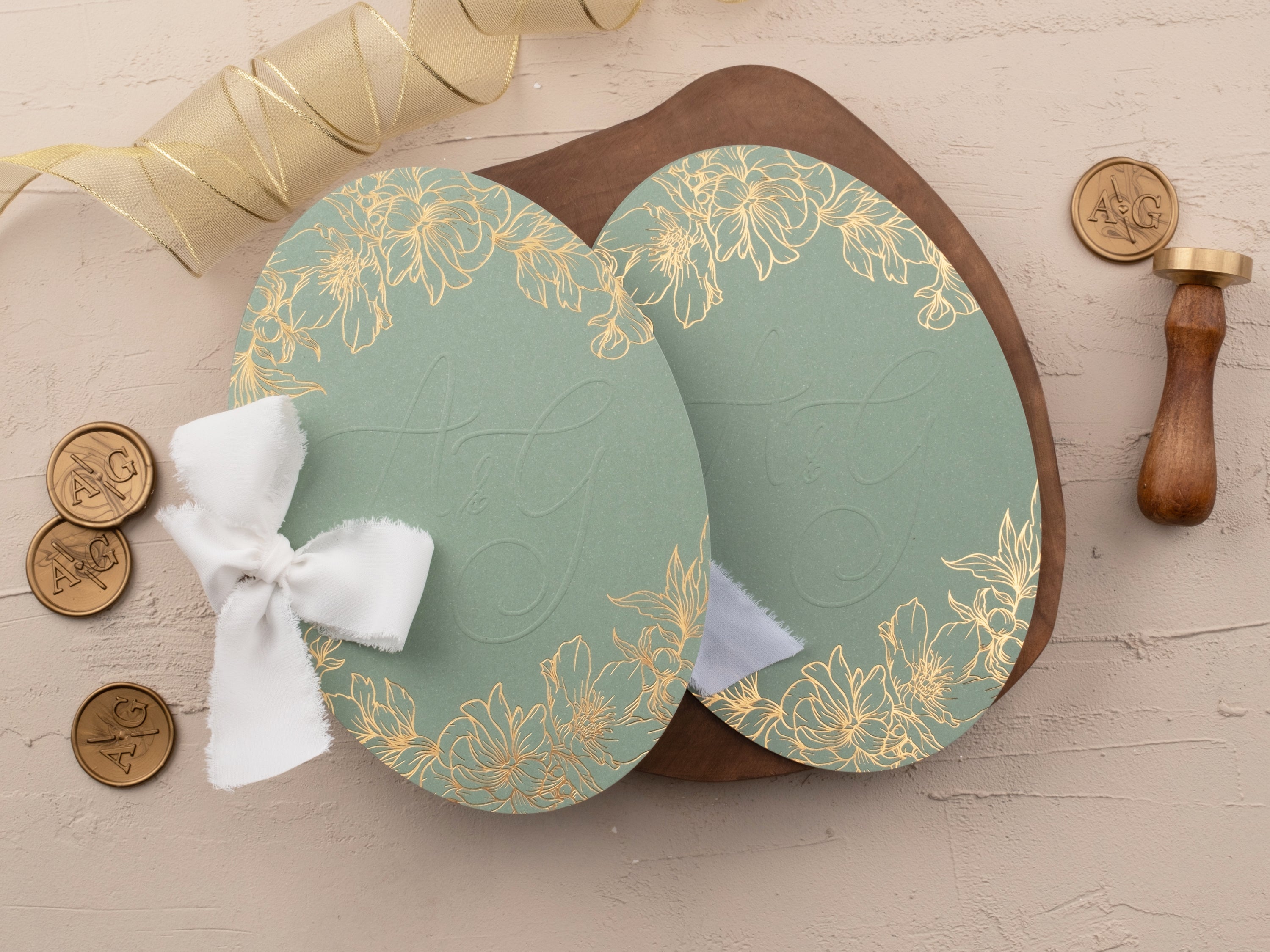
Foil acrylic describes a finish applied to the acrylic. Metallic foil can highlight names, a border, a crest, or selected artwork. It reflects light instead of appearing flat, which gives the design more contrast and ceremony. In the foil-printed acrylic wedding invitations collection, you will see foil paired with clear, colored, and layered acrylic designs.
These categories can overlap. A clear acrylic invitation may also include foil, so the real decision is often between a restrained transparent design and one that uses a metallic finish as a focal point. Start by deciding what guests should notice first: the material itself, the wording, or the reflective detail.
Which Acrylic Invitation Style Feels More Formal?
Foil often makes an acrylic invitation feel more formal because the finish responds to light and emphasizes the most important parts of the design. Gold, silver, rose gold, or black foil can frame the couple’s names, define a monogram, or add a polished edge without covering the transparent surface.
Clear acrylic can still suit a formal wedding. A spacious layout, refined typeface, carefully placed white ink, and a structured jacket can feel just as considered as metallic foil. The difference is mood: clear designs tend to feel quiet and modern, while foil designs tend to feel celebratory and detailed.
Let the venue and dress code guide you. A minimal clear card can look at home in a gallery, greenhouse, or modern coastal venue. Foil can complement a ballroom, hotel, estate, or evening celebration. Neither finish sets the formality alone; typography, color, paper layers, and presentation complete the effect.
How Readable Are Clear Acrylic Wedding Invitations?
Clear acrylic invitations are easy to read when the design creates enough contrast. Dark lettering usually reads clearly against a light envelope or backing card. White ink can look crisp against a dark jacket. Fine pale text placed over a busy background is more likely to disappear, especially in changing light.
Readability also depends on type size and spacing. Keep essential details such as names, date, time, and venue large enough to scan comfortably. Give decorative scripts room to breathe, and use a simpler typeface for addresses or longer lines. The transparent material should support the wording, not compete with it.
Always judge a physical sample against the colors you plan to use in the finished suite. Hold it over the envelope, jacket, or backing card and view it in natural and indoor light. That quick test shows whether the contrast remains dependable once the invitation reaches your guests.

When Does Foil Work Best on an Acrylic Invitation?
Foil works best when it has a clear purpose. Use it to create hierarchy around the couple’s names, a crest, a border, or one meaningful illustration. A focused metallic element has more impact than foil applied to every line. Supporting information can remain in a simpler print finish so guests know where to look first.
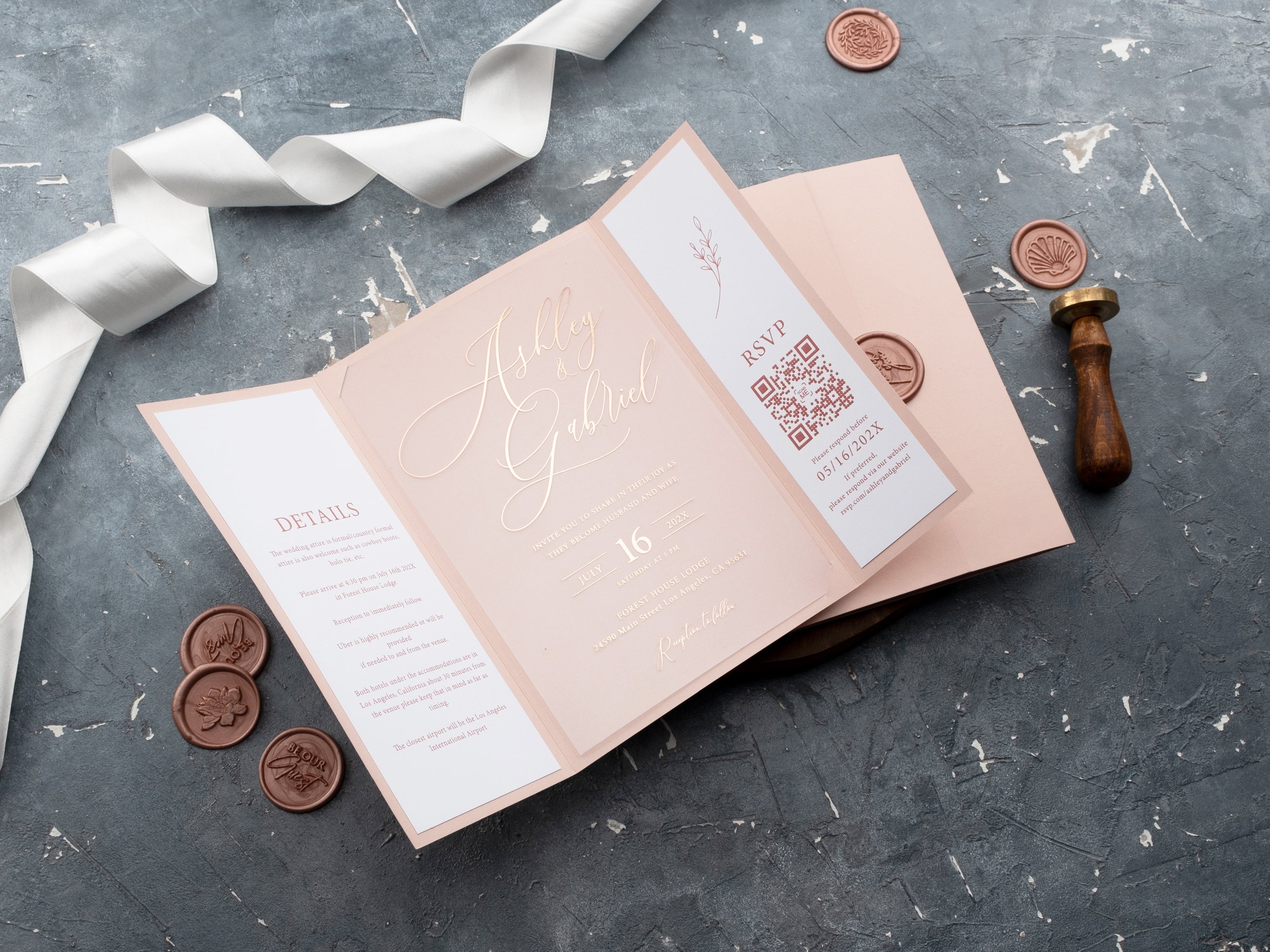
The foil color should also work with the rest of the palette. Gold adds warmth to ivory, navy, burgundy, emerald, and blush. Silver feels clean with white, gray, blue, or winter palettes. Rose gold softens pink, cream, and rich jewel tones. Black foil can add graphic contrast to pale acrylic or paper layers.
If you like metallic detail but are still deciding on material, compare the wider foil printed wedding invitations range. Seeing foil on both paper and acrylic can help you decide whether the reflective finish or the transparent card is the more important part of your vision.

Can Acrylic Invitations Include Photos or Colored Jackets?
Yes. A photo can appear on a printed layer, an outer jacket, or within a design that combines acrylic with paper. This approach keeps the main card contemporary while giving the suite a more personal introduction. Confirm the exact personalization options on the product listing because available layouts differ by design.
Colored jackets and backing cards are especially useful with acrylic. They add contrast behind the wording, protect the card, and connect the invitation to the wedding palette. A blush jacket can soften the look, navy or black can increase formality, and sage or ivory can keep the suite calm and natural.
Keep the layers intentional. If the acrylic already includes foil, a photograph, and detailed artwork, choose a quieter jacket. If the card is very minimal, the outer layer can carry more color or texture. The goal is a clear visual order when guests open the suite.
What Should You Consider Before Mailing Acrylic Invitations?
Acrylic can weigh more and feel less flexible than a standard paper card. The final postage depends on the complete suite: card thickness, jacket, inserts, envelope, and any raised embellishments. Assemble one finished invitation exactly as a guest will receive it, then measure and weigh that sample before buying postage.
Protect the card from rubbing and sharp impacts. A fitted jacket, backing layer, or tissue can help separate the acrylic from other components. Check that foil and printed details do not catch on the envelope and that corners cannot move freely enough to damage the paper during transit.
Ask your postal provider to assess the completed sample rather than estimating from the acrylic card alone. Size, rigidity, thickness, and weight can affect handling as well as price. Testing one suite early is much easier than changing envelopes or postage after the full order arrives.
How Do You Choose the Right Acrylic Invitation for Your Wedding?
Begin with the information you need to print. Long wording, multiple locations, or bilingual text may require a simpler layout and stronger contrast. Short formal wording gives you more freedom to use a large monogram, spacious typography, or a dramatic foil detail.
Next, compare the invitation with the wedding environment. Choose clear acrylic for an airy, minimal, or architectural mood. Choose foil when you want a metallic focal point and a more ceremonial finish. If you want both, select a clear card with restrained foil and let the surrounding jacket control the background color.
Finally, order a sample before approving a full quantity. Check transparency, foil tone, thickness, edge finish, wording contrast, and how the assembled suite feels in hand. Explore our acrylic wedding invitations to compare clear cards, foil details, and personalized formats for your celebration.
Frequently Asked Questions About Acrylic Wedding Invitations
Are clear acrylic wedding invitations hard to read?
They can be easy to read when the type size, contrast, and spacing are chosen carefully. Dark or foil text usually creates stronger contrast than pale, thin lettering.
Do foil acrylic invitations look more formal?
Often, yes. Foil adds reflective detail that can make a minimalist acrylic card feel more celebratory and formal.
Can acrylic invitations use colored envelopes or jackets?
Yes. A colored jacket, backing card, or envelope can add contrast and protect the card in transit.
Are acrylic wedding invitations heavy to mail?
They can weigh more than paper suites. Confirm the completed suite’s thickness, weight, and postage before mailing.
Can you add a photo to acrylic wedding invitations?
Some acrylic invitation designs can incorporate a photo or pair the acrylic card with a printed photo jacket. Confirm the chosen listing’s personalization options before ordering.
Should you order acrylic invitation samples first?
Yes. A sample helps you judge transparency, foil contrast, thickness, and how the finished suite feels in hand.
Compare clear cards, metallic details, and layered formats in our acrylic wedding invitations.

Leave a comment
This site is protected by hCaptcha and the hCaptcha Privacy Policy and Terms of Service apply.