
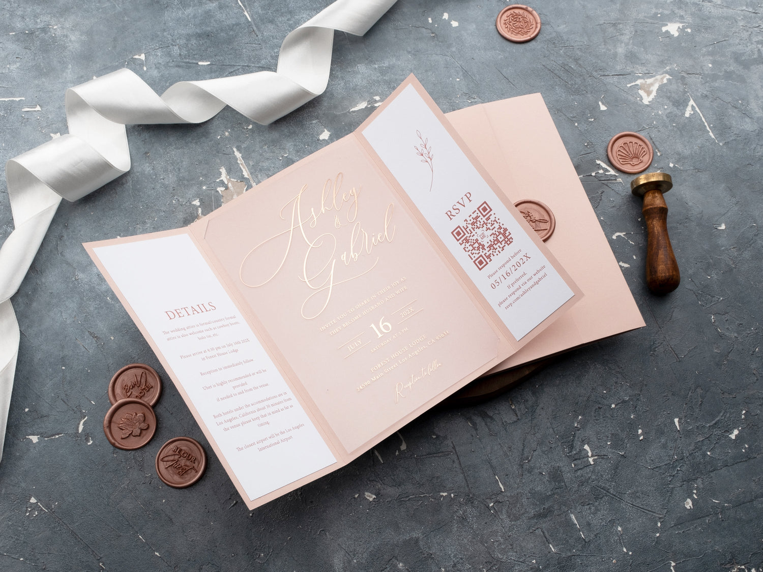
In short: Rose gold wedding invitations bring a warm metallic glow that can feel romantic, modern, or refined. Use rose gold foil when you want light-catching names and borders, or pair it with acrylic for a contemporary statement. Keep the palette focused so the metal finish remains readable and elegant.
Rose gold sits between the softness of blush and the brightness of a metallic finish. That balance makes it versatile: it can warm a minimal invitation, soften a formal dark palette, or add a polished highlight to clear acrylic. The effect depends on where the finish appears and what surrounds it.
Choosing rose gold is not only a color decision. You also need to think about the card material, wording contrast, venue, and the way each piece works together. This guide explains how to use rose gold foil with control, compare paper and acrylic options, and build a suite that feels cohesive rather than overly coordinated.
What Makes Rose Gold Wedding Invitations Feel Distinctive?
Rose gold reflects light like a metallic finish but has a warmer, pink-toned character than yellow gold or silver. That warmth can make formal stationery feel more approachable while still giving names, borders, and monograms a polished edge. It works particularly well when the rest of the design leaves enough space for the foil to be noticed.
The finish can shift with its surroundings. On ivory or blush, rose gold feels soft and romantic. Against navy, burgundy, black, or deep green, it appears stronger and more formal. On transparent acrylic, the metal becomes a defined focal point because it contrasts with the open background.
Use that flexibility deliberately. Browse rose gold foil printed wedding invitations and notice which designs use the finish for hierarchy rather than decoration alone. The most successful examples guide the eye to the couple’s names or one meaningful design detail.
Which Colors Pair Best With Rose Gold Foil?
Ivory and white create a light, classic base that lets rose gold add warmth without making the suite feel too colorful. Blush creates a tonal look, but the shades should be different enough for the foil to remain visible. A slightly cooler or lighter paper can help the metal stand apart.
Deep colors create stronger contrast. Navy feels polished, burgundy feels rich and romantic, black feels graphic, and forest or sage green can connect the finish to a garden or estate setting. If the background is dark, keep supporting text clear and avoid very fine foil lettering for essential details.
You do not need to match every element to the metal. Let rose gold act as the accent, then use one or two supporting colors across the envelope, jacket, or printed layer. A focused palette is easier to read and usually feels more refined than several competing metallic and pastel tones.

Should You Choose Rose Gold Foil or Rose Gold Acrylic?
Rose gold foil describes the reflective finish. It can be applied to paper or acrylic, so start by deciding whether you want the invitation material to feel traditional, tactile, transparent, or layered. Paper gives you more control over background color and texture. Acrylic makes transparency and edge detail part of the design.
A paper invitation with rose gold foil can feel timeless and formal, especially with ivory, blush, navy, or burgundy stock. It also works well when the wording is longer because the solid background supports consistent contrast. If you like metallic detail but want to compare other foil colors and papers, explore foil printed wedding invitations.
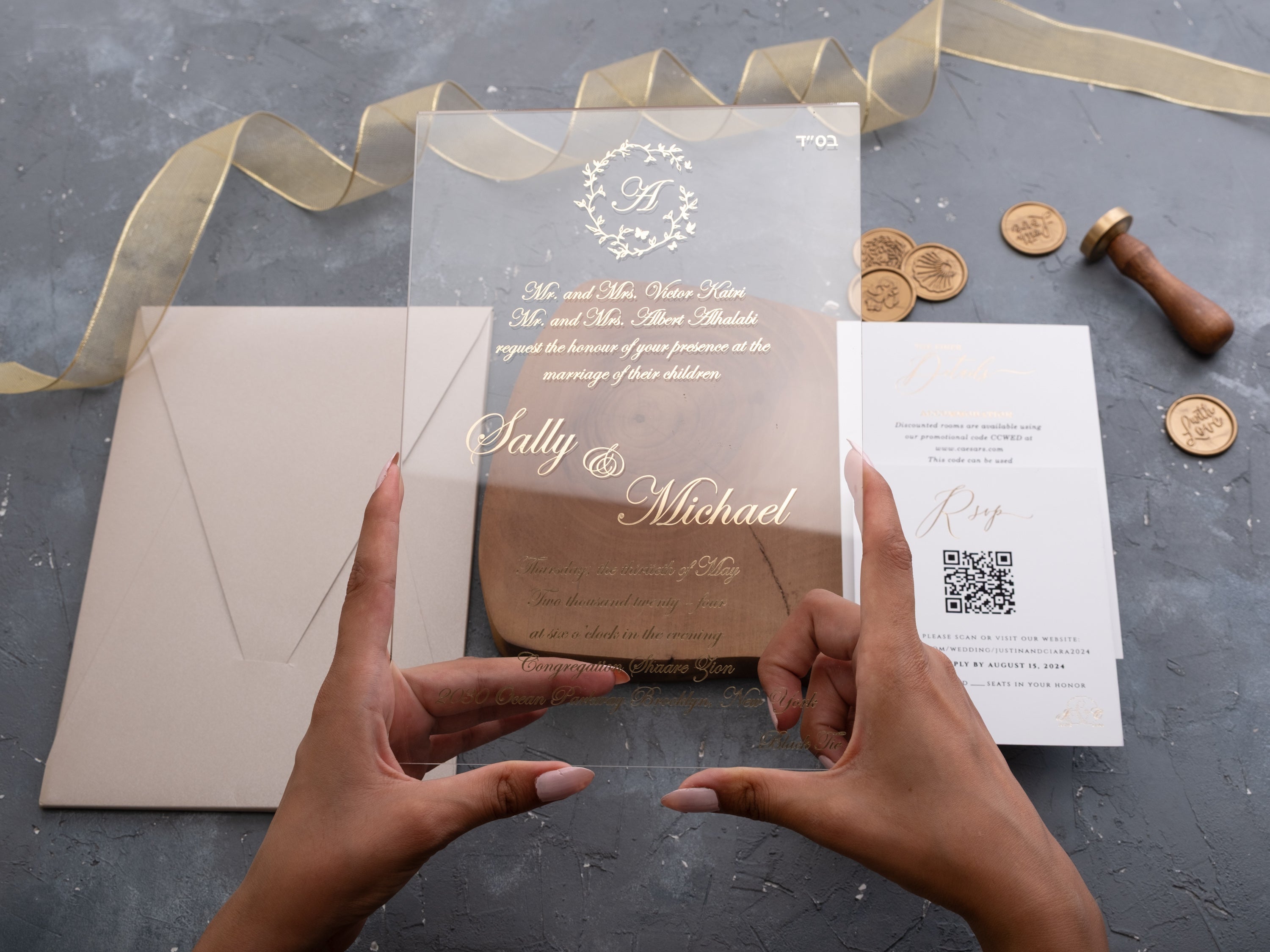
Rose gold acrylic feels more contemporary. The metallic detail appears to float on the surface, and a colored jacket can change the background behind the card. Browse rose gold foil printed acrylic wedding invitations if you want transparency, layered presentation, and a stronger material statement.

How Do You Keep Rose Gold Invitation Wording Readable?
Give essential information strong contrast and enough size. The couple’s names can carry a more decorative treatment, but the date, time, venue, and address should remain easy to scan. Fine foil script may look beautiful in a close photograph yet become difficult to read under soft indoor light.
Use foil for selected lines and pair it with a clear printed color for supporting text. On a pale card, charcoal, black, or a deep neutral can keep details dependable. On a dark card, choose a light print color or make sure the foil is thick enough to remain distinct from the background.
Ask to review a proof at the size it will be printed. Zoomed-in digital previews can hide spacing and contrast problems. If possible, order a physical sample and view it from a normal reading distance in daylight and evening light before approving the full quantity.
Can Rose Gold Work for a Modern or Formal Wedding?
Yes. For a modern wedding, use rose gold as a precise accent on clear acrylic, a simple arch silhouette, or a minimal card with generous white space. Keep the typography clean and let the material or shape provide the visual interest.
For a formal wedding, pair the finish with structured typography, a dark or neutral palette, and a layered jacket or envelope. A centered crest, border, or monogram can create ceremony without covering the entire invitation in foil. The invitation feels formal because the hierarchy is controlled, not because every detail shines.
The venue can help you choose the balance. A loft, gallery, or modern resort may suit transparent acrylic and restrained foil. A ballroom, estate, or evening celebration may support a darker jacket and more traditional arrangement. Rose gold can adapt to either setting when the surrounding design is consistent.
How Should Rose Gold Details Carry Through the Suite?
Repeat the finish where it helps guests understand the suite. The invitation, a monogram on the jacket, or a heading on one important detail card may be enough. Supporting pieces do not all need foil to feel coordinated; matching typography, paper color, and spacing can carry the system.
Use the same rose gold tone when pieces will be viewed together. Different suppliers or printing methods can produce noticeably different warmth and reflectivity. Request samples if the invitation and supporting cards are produced separately, and compare them under the same light.
Keep practical information simple. Travel details, schedules, and longer instructions usually benefit from a flat printed color with strong contrast. Reserve the metallic finish for the moments that deserve emphasis. This saves visual space and makes the suite easier to navigate.
What Is the Best Way to Choose a Rose Gold Invitation Design?
Begin with the wedding palette and wording. If the suite needs a solid, dependable background for longer text, start with paper. If transparency and a modern presentation matter more, compare acrylic wedding invitations and decide how much of the rose gold detail should appear on the card itself.
Next, identify one focal point. It may be the couple’s names, a crest, a border, or a floral illustration. Let the foil support that element, then keep the remaining text and colors quieter. This gives the invitation a clear first impression when guests open it.
Finally, order a sample of the closest design. Check foil tone, readability, material thickness, edge finish, and the way the full suite fits in its envelope. Explore our rose gold foil and acrylic wedding invitations to find a warm metallic finish that fits your celebration.
Frequently Asked Questions About Rose Gold Wedding Invitations
What colors go well with rose gold wedding invitations?
Soft blush, ivory, white, deep burgundy, sage, and navy can all create effective contrast with rose gold, depending on the wedding mood.
Does rose gold foil work on dark invitations?
Yes. A darker background can make rose gold foil stand out clearly, provided the surrounding wording stays legible.
Are rose gold wedding invitations formal enough for an evening wedding?
Yes. A focused rose gold foil design on a dark, neutral, or rich-color background can feel polished and formal.
Can rose gold work with acrylic invitations?
Yes. Rose gold foil can add warmth and contrast to a clear or colored acrylic card.
How do you make rose gold text easy to read?
Use adequate type size, spacing, and contrast. Avoid placing fine foil lettering over a busy image or low-contrast background.
Should every stationery piece use rose gold foil?
Not necessarily. Repeating the finish on key pieces can create cohesion while leaving enough visual space for the invitation wording.
Explore our rose gold foil wedding invitations to compare warm metallic finishes for your celebration.

Leave a comment
This site is protected by hCaptcha and the hCaptcha Privacy Policy and Terms of Service apply.