
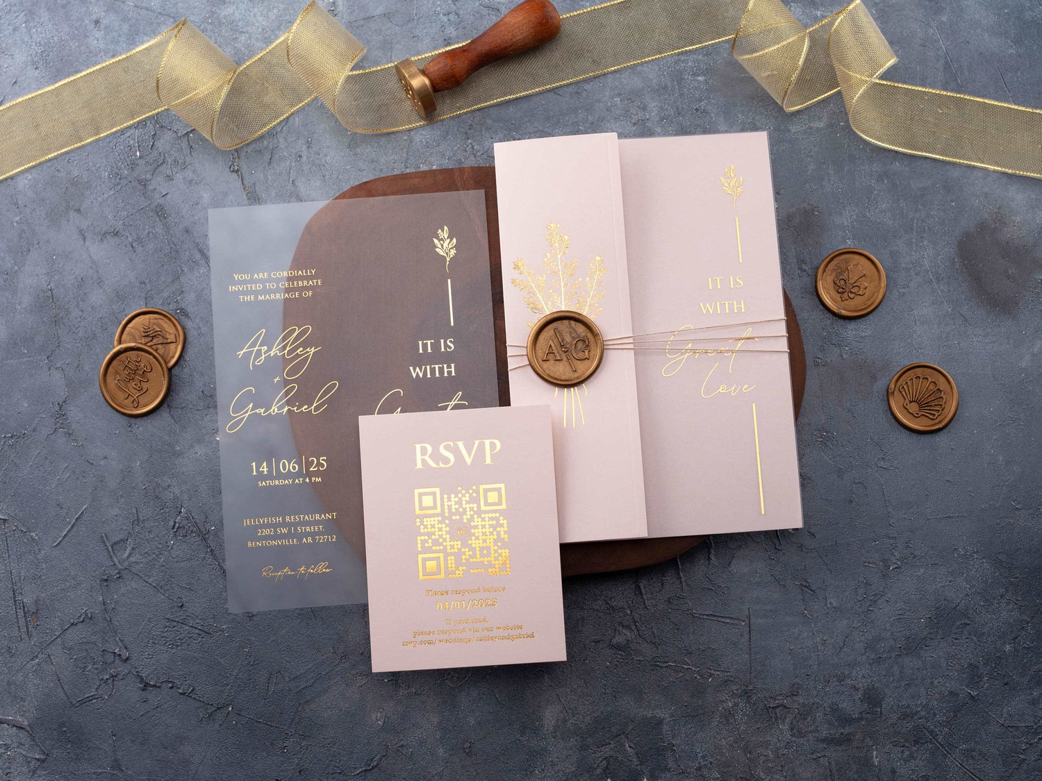
In short: A wedding invitation looks luxurious when its material, printing, spacing, and finishing details feel intentional together. Thick paper, acrylic, foil, embossing, deckled edges, and restrained typography can all elevate the design, but the strongest result comes from choosing a few premium elements instead of combining every available finish.
Luxury is not one material or one price point. It is the feeling created when paper, printing, typography, color, and finishing choices support the same visual idea. An invitation can use gold foil and still feel busy, while a simple card on excellent stock can feel polished because the spacing, hierarchy, and details are controlled.
The right premium finish should also fit your wedding. A formal evening celebration may suit metallic foil and a structured suite, while a garden wedding may feel more natural with textured paper and deckled edges. Use this guide to compare the options before you order samples or commit to a full invitation quantity.
What Makes a Wedding Invitation Look Expensive?
The first sign of a refined invitation is intention. Guests should immediately understand whose wedding it is, when it takes place, and where they need to go. A clear hierarchy, generous white space, and carefully aligned elements often communicate quality more effectively than extra decoration.
Consistency matters just as much. The typeface, ink or foil color, envelope, inserts, and finishing details should feel like one suite. If every element competes for attention, the design can lose its premium character. Choose one focal point, such as a monogram, foil name treatment, or tactile paper, and let the remaining details support it.
You can see this principle across our luxury wedding invitations, where material and layout work together instead of relying on one decorative feature.
Which Paper and Materials Feel Most Luxurious?
Thick paper feels substantial in the hand and provides a stable surface for crisp printing. Smooth stocks suit modern typography and clean lines, while cotton and textured papers add softness and depth. The best choice depends on whether you want the invitation to feel architectural, romantic, traditional, or handmade.
Acrylic creates a different kind of luxury. Clear, frosted, or colored acrylic gives the invitation a modern presence and makes foil or printed details appear especially sharp. Browse acrylic wedding invitations if you want a contemporary statement, but check weight, protective packaging, and postage before ordering.
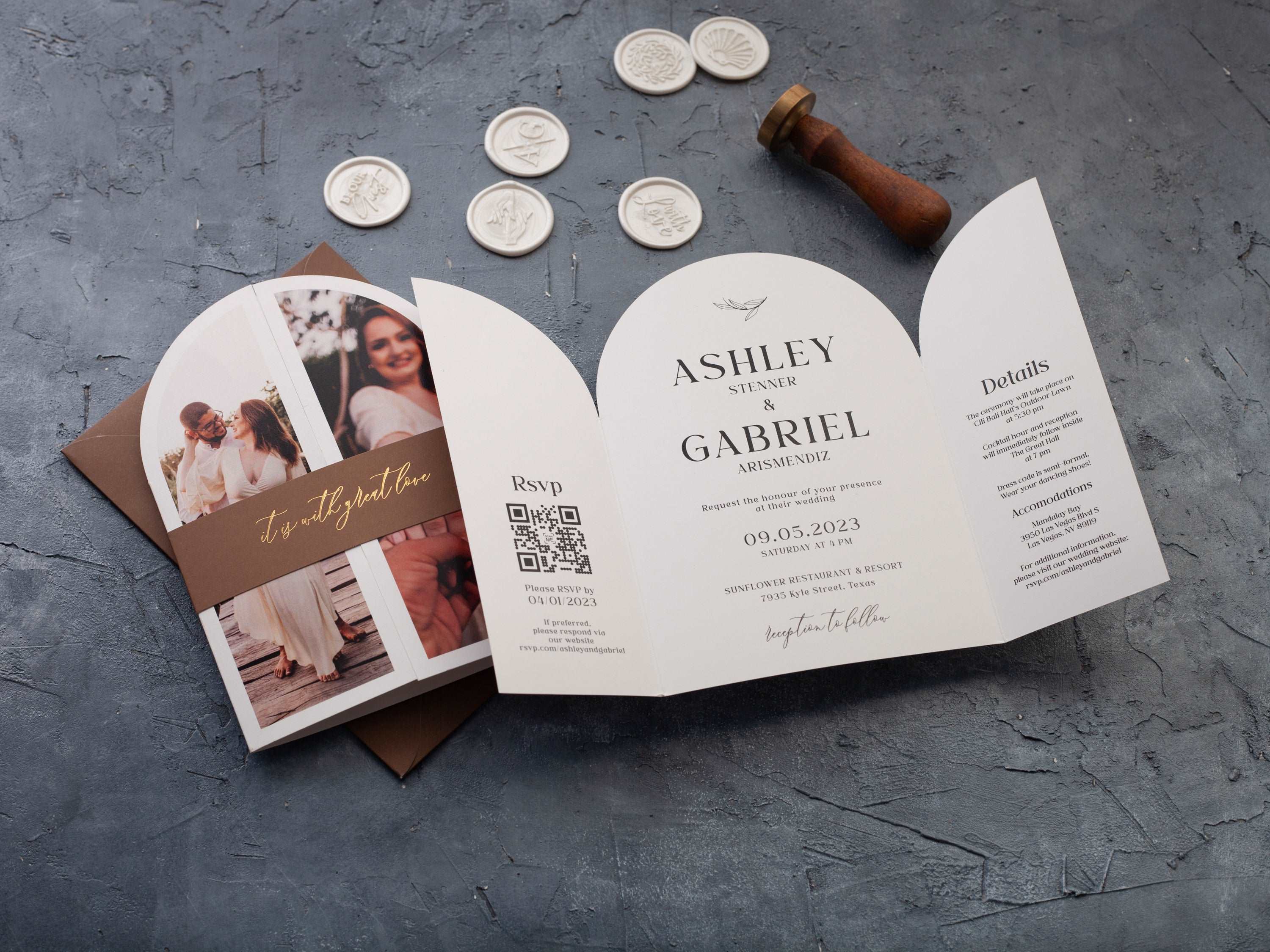
Deckled paper brings an artisanal finish, while layered cards, vellum jackets, and pocket formats add structure. Each layer increases visual and physical weight, so use layers when they organize information or strengthen the design—not simply because they are available.
- Smooth premium paper: best for crisp, modern printing.
- Textured or cotton stock: best for a soft, tactile impression.
- Acrylic: best for a bold, contemporary presentation.
- Deckled paper: best for romantic, editorial, or handmade styling.
How Do Foil Printing and Embossing Change the Design?
Foil printing adds reflected light and contrast. Gold feels warm and traditional, silver feels cool and modern, and rose gold introduces a softer romantic tone. A small foil area can be more effective than a fully metallic design because the eye knows exactly where to look.
Embossing creates a raised detail, while debossing presses a shape into the surface. Both add interest through touch and shadow. These techniques work especially well for monograms, borders, seals, and restrained patterns. Explore embossed wedding invitations to compare how texture changes a design without adding another color.

For a brighter focal point, foil printed wedding invitations make names, dates, and line details stand out. Ask for a physical sample whenever possible because screen previews cannot show reflection, depth, or the way the finish changes under different light.
Are Acrylic Wedding Invitations Worth the Premium?
Acrylic can be worth the premium when the material supports your event style. It suits modern venues, evening celebrations, black-tie weddings, and designs that use clean typography or metallic details. It also has a keepsake quality because it feels different from traditional paper the moment a guest opens the envelope.
The practical tradeoffs are weight, protection, and mailing. Acrylic may require a sturdier envelope, a protective insert, and additional postage. Before you approve a full order, assemble one complete invitation exactly as a guest will receive it and have it weighed.
If you love the clear look but want a lighter suite, consider using acrylic for the main invitation and paper for details, or reserve acrylic for a smaller guest count. A premium choice feels smartest when it supports both the design and the way you will actually send it.
When Do Deckled Edges Suit a Wedding Style?
Deckled edges suit weddings that feel romantic, artistic, natural, or editorial. The irregular edge adds softness and makes each card feel less machine-perfect. It pairs beautifully with restrained typography, botanical artwork, watercolor, letterpress-style impressions, and neutral or earthy palettes.
They can also work for formal weddings when the rest of the design is controlled. Choose deckled edge wedding invitations with elegant type and a focused color palette if you want texture without a rustic result. Avoid adding too many competing embellishments, since the edge already provides a strong visual detail.

Which Luxury Details Give You the Best Value?
Start with the element guests will notice first: material quality. A stronger stock or well-finished acrylic base improves the entire invitation, even when the printing is simple. Next, invest in readability and layout. A clear design feels more premium and reduces the risk of important information being missed.
After the foundation is right, choose one signature finish. Foil names, an embossed monogram, a deckled edge, or a vellum jacket can create the focal point. You do not need all of them. Limiting the number of upgrades often produces a more sophisticated result and keeps the budget focused.
- Prioritize the main invitation material.
- Keep typography clear and spacing generous.
- Select one finish that matches the venue and dress code.
- Use inserts only for information guests genuinely need.
- Order a finished sample before approving the full quantity.
How Should You Compare Premium Invitation Samples?
Review samples in daylight and evening light. Look at color accuracy, foil coverage, print sharpness, edge quality, and whether small text stays easy to read. Run a clean finger lightly over printed and embossed areas to understand the texture, but handle foil carefully so you can also judge durability.
Then assemble the complete suite. Place every card inside the envelope, add any liner, ribbon, or jacket, and check whether the package closes cleanly. Measure and weigh it so postage is part of the decision rather than a surprise after production.
Finally, compare the sample to your wedding rather than to other invitations. The best design is the one that introduces your venue, formality, and personality clearly. A coherent suite will feel more luxurious than a trend-heavy design that does not match the celebration.
- Check readability and hierarchy.
- Inspect print, foil, and edge consistency.
- Assemble and weigh the full suite.
- Confirm the colors under realistic lighting.
- Choose the finish that best supports your wedding style.
What Should You Know Before Ordering Luxury Wedding Invitations?
What material makes wedding invitations look luxurious?
Thick premium paper, clear or frosted acrylic, and textured stocks can all feel luxurious when the printing and layout suit the material.
Does foil printing make invitations more expensive?
Foil usually adds production cost because it requires a specialized process, but one focused foil detail can create strong impact without covering the whole design.
Is embossing the same as letterpress?
No. Embossing raises a design from the surface, while letterpress presses ink or an impression into the paper.
Are deckled edges appropriate for formal weddings?
Yes. Deckled edges can feel refined and artisanal, especially with elegant typography and restrained colors.
Do acrylic wedding invitations need special envelopes?
They may need protective packaging and additional postage, so confirm thickness, weight, and mailing requirements before ordering.
How can you make invitations luxurious on a limited budget?
Prioritize one premium feature, keep the layout spacious, use a strong paper stock, and simplify extra inserts or decorative layers.
Ready to compare refined materials and finishes? Explore our luxury wedding invitations and choose a design that feels unmistakably yours.

Leave a comment
This site is protected by hCaptcha and the hCaptcha Privacy Policy and Terms of Service apply.